JOZO salt
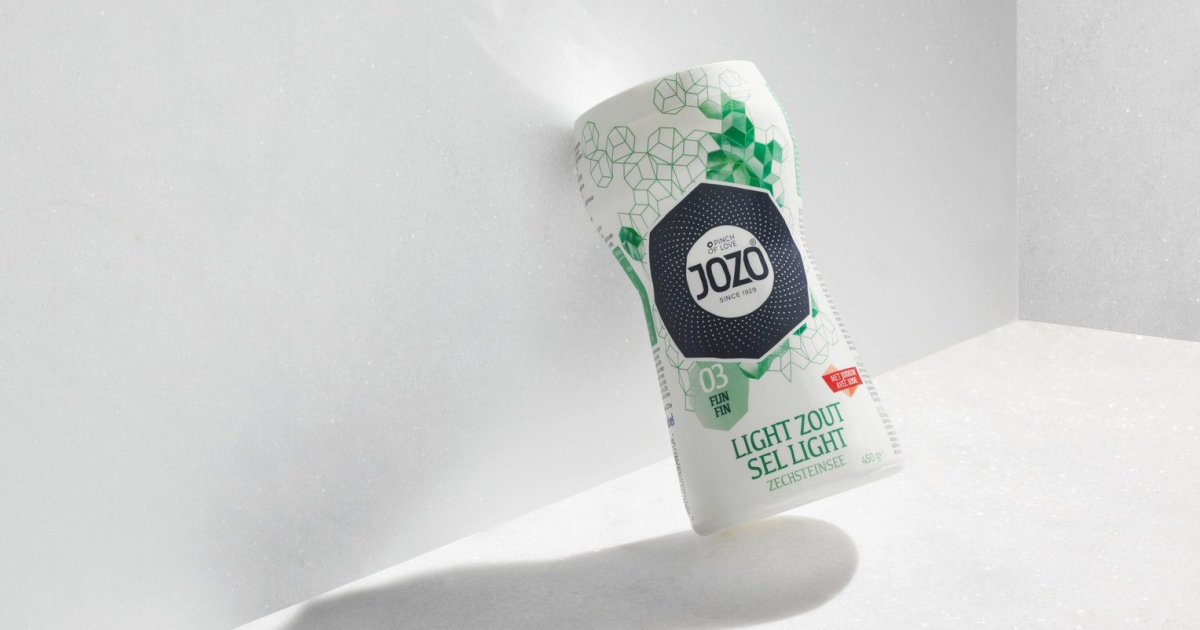
We believe that the key to success lies in (re)establishing the emotional connection between consumers and salt by explaining the power of salt as a taste enhancer and love ingredient: with salt you add love. Love for food, love for life and love for your loved ones: all expressed in a perfectly salted meal.
As the first brand ever, JOZO introduced a new way of selecting, buying and applying salt with the single objective to help consumers bring out the best in their dishes.
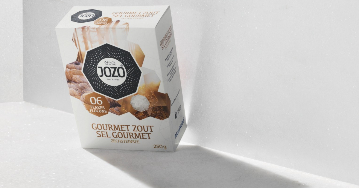
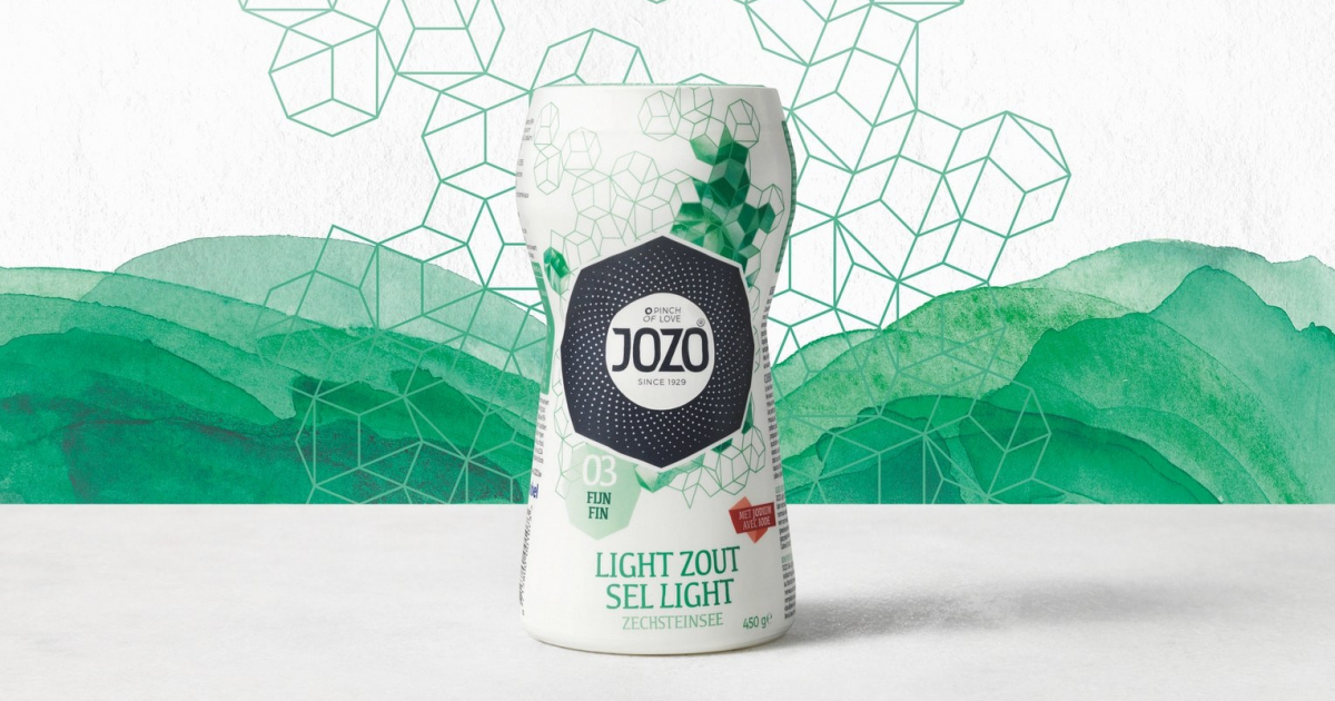
The new design tells the story of Master Grinder JOZO and of modern craftsmanship that is set to help people get the best out of their meal with salt.
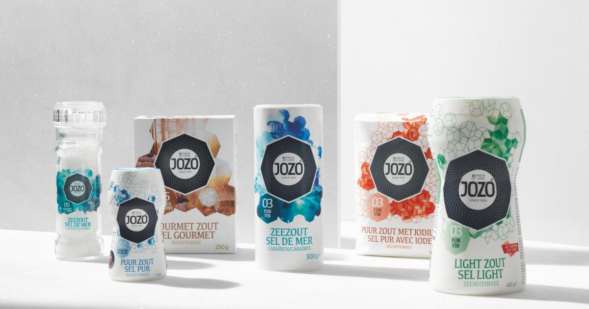
The new JOZO brand design has had a global impact: we introduced it in 7 countries and 9 languages with 75 identical SKUs in total, B2B and B2C. It significantly raised brand awareness internally at AkzoNobel as well as on retailer and consumer level. New and additional listings were realized in several countries.
As a team, we learned once again that brand design – taking the brand as a starting point for design and putting design at the center of a brand strategy – is crucial when you don’t want to compete but excel.
JOZO has mastered the sourcing, purification and crystallization of salt since 1929. Salt that comes from the best sources nature has to offer. JOZO is THE MASTER GRINDER (creative platform). His expertise and craftsmanship were the starting point for the new JOZO.
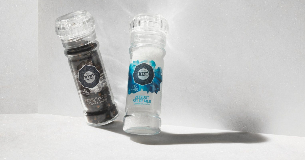
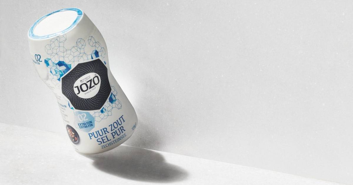
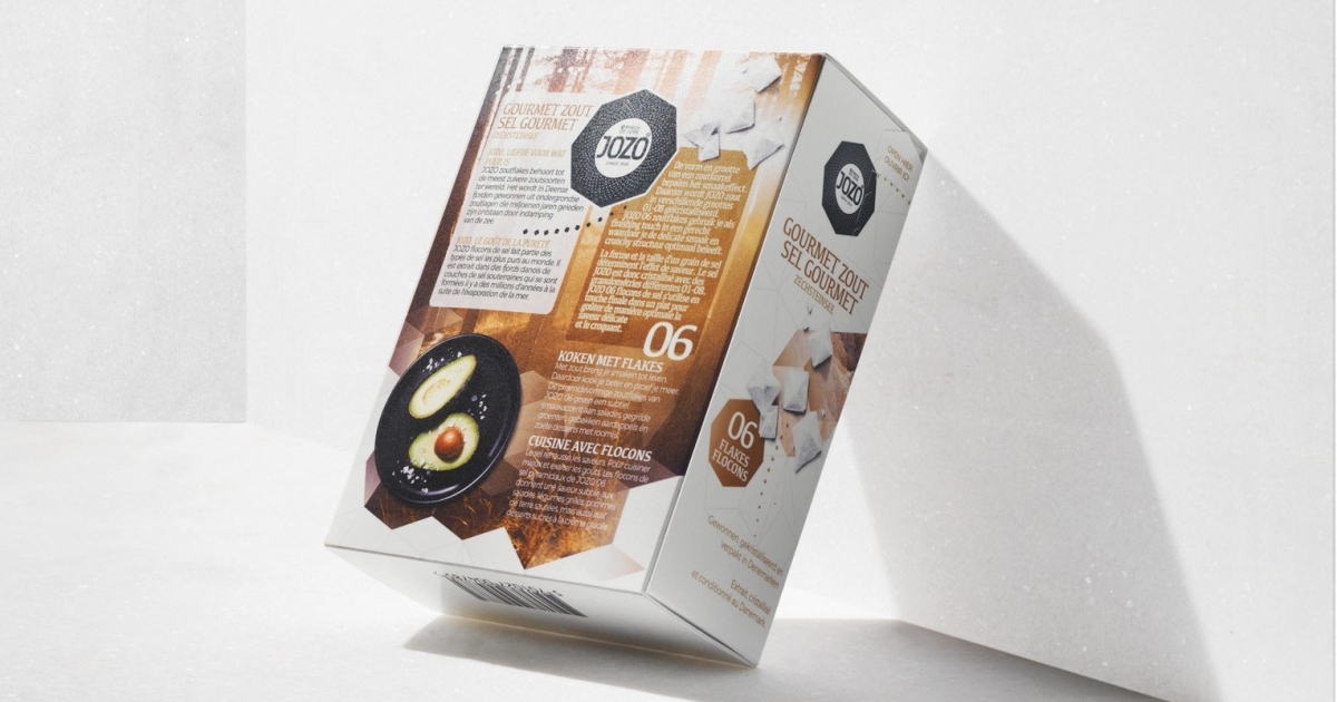
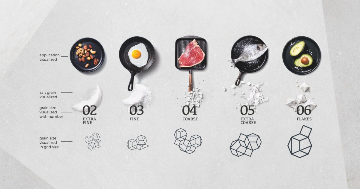
On consumer level, only few know about the power of salt and its ability to enhance the taste of ingredients beyond just adding saltiness. Furthermore, one size of salt does not fit all meals: it’s the source, shape and size of a salt grain that determines the actual flavor impact. In the new design, these elements come together in a combination of color, pattern, grid size and story telling with visual elements. They help consumers select the right salt to make the best out of their meals.
The visual ID represents the unique shape of salt crystals and was inspired by the dodecaëder. The crystal became our identity, the pattern our visual style. The crystal has an octagonal shape, which links nicely to the 8 different grind sizes JOZO offers. It holds a central place in all brand expressions, reinforcing the JOZO brand and its expertise as master grinder. In the end we created a holistic JOZO reality (packaging, ads, brand movie, displays, website, social) full of wonderful and contagious design elements.
A halt to the devaluation of JOZO salt
Salt has lost its meaning. Once crucial for food preservation, a means of trade and exchange (sal-ary), and an essential, valuable, multi-faceted ‘partner’ in daily life, it has evolved to a low interest food ingredient. Consumers are split between taste and health. Salt is increasingly banned from our daily meals, while most of us don’t know the truth about the power of salt and what makes for a healthy salt intake.
JOZO was and is determined to re-establish the appreciation and value of its salts. It wants to escape the commodity market and become a true value brand (again).
JOZO realized that a complete rethinking of the brand positioning and brand strategy would be needed to start the redesign process. And that is exactly what we did.
Starting with the 3D packaging as a white canvas, JOZO asked us to develop design that would communicate close to 90 years of expertise and love for salt. Design that would awe the world and that would open up new markets and possibilities.

