A-dam Underwear
It’s what’s on the inside that counts!
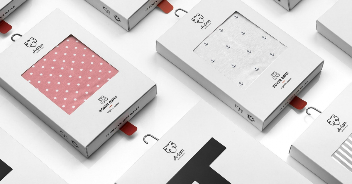
1. The ‘tongue-in-cheek’ pack design reflects A-dam’s attitude: stylish/responsible outside, with a naughty/humorous spirit inside.
Pulling the red tab seems purely functional, but appears to be a mischievous act once the boxer is removed from the tray: an unexpected piece of art is unveiled. This moment of surprise will stick and positively impact the net promotor score.
Regularly A-dam will invite graphic artists to create new surprising art (linked to signature red tab) to keep future purchases exciting. This will make packs collectable, evoke curiosity and build brand loyalty.
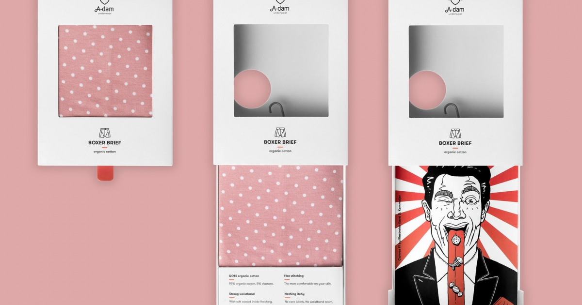
2. A clever box with sliding tray (please read ‘Insights’ for details) solves the functional issues. The ‘sliding’ adds value to communication: USP’s are highlighted in a playful way.
3. Cost reduction of 30% has been achieved by eliminating magnets/gluing, without compromising - even improving - functionality. Traveling with glue guns is history and business goals can be reached.
INSIGHTS
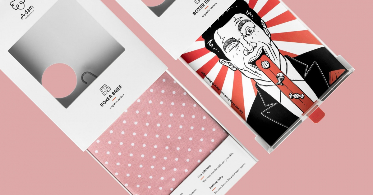
*A canvas for graphic artists*
When taking out the boxer short from the pack, consumers are in for a surprise: an unexpected piece of art. The inside of the tray serves as a canvas for graphic artists. By inviting those artists the guys behind A-dam want to show their love for popular culture and street art, and offer graphic artists an opportunity to show their work to the world in an unconventional way.
*A cleverly engineered cardboard box with lots of functionalities*
The large window in the white box offers consumers clear focus on the product’s most important discriminator: the pattern design. The red tab allows more demanding shoppers to slide out a little drawer to check fabric, waistband and size: a must have in this category. An ingenious die cut folding board construction prevents the tray from being pulled out too far, so the pack can always be closed again easily, without damage. This is of course crucial to keep everything nice and tidy in stores at all times. Moreover, while sliding, a small round window at the back reveals the boxers unique selling points one by one: Organic Cotton, Flat Stitching, Nothing Itchy, Strong Waistband. A clever rotating metal hook, properly enclosed so it can’t be separated from the pack, outperforms many known hanging solutions in premium look & feel, without compromising logistic efficiency.
*A cost reduction with benefits*
Cost reduction has been realized by eliminating magnetic closures and significantly reducing gluing. The entire pack can now be made out of 2 printed cardboard parts that can be folded together. There is only 1 glue area left. Eliminating the magnets is also better for the environment. All this did not compromise functionality, but even improved it. The pack can still be opened and closed, but it became easier to put the boxer short back in. The sliding tray even gave the opportunity to increase communication surface and show important additional information on USP’s.
An impact on business growth
The new packaging received very positive feedback from retailers and enabled A-dam to develop a larger distribution channel. A-dam’s products are now available in more than 100 shops in 6 countries and online.
An innovative and responsible brand
A-dam Underwear likes to do things differently and better. “If you’ve got balls,” it communicates provocatively on the pack’s tray. All itchy details and annoying seams have been removed or improved. Only certified organic cotton is being used. The boxers are being made manually by people that earn fair wages for regular working hours.
*A culturally infused logo*
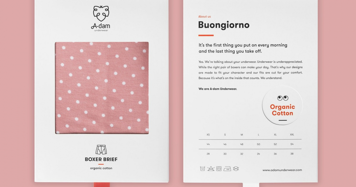
A-dam Underwear is an upcoming men’s underwear brand from Amsterdam, The Netherlands. A’dam is a commonly used abbreviation of Amsterdam and of course Adam was the world’s first inhabitant in need of underwear, hence the brand name and the fig leaf logo. The little X on top of the fig leaf refers to the 3 Saint Andrew’s crosses that are part of the coat of arms of Amsterdam.
The young Amsterdam based brand A-dam strives to make the best men’s underwear ever made: hand crafted, premium quality, perfect fit, organic cotton only. Their former pack wasn’t good enough to support this ambition and realize significant growth.
The brief was to design a pack that:
1. Reflects brand attitude
The old pack was a bit boring. Its brown paper look did not reflect the fresh and slightly crazy attitude of the brand and the energetic guys behind it.
2. Solves functional issues
Consumers opened the old pack the wrong way and had difficulties reclosing it. Even worse: the hanging hook broke off easily. This led to a mess, unhappy shop owners and A-dam staff traveling around to glue things together.
3. Brings cost down
The old pack featured a costly magnetic closure and needed a lot of manual gluing. To become profitable this had to change.
With the dimensions given, the creative challenge was: how to put some excitement in a straightforward box and generate impact for the brand?