A'DAM Toren
The A’DAM brand and style of communications caused quite an impact in the conservative world of real estate or property branding. The idea of ‘a talking building’ commenting on his redevelopment plans, his surroundings, music and popular culture was highly distinctive and unique.
Even though A’DAM Toren was a closed building site until May 2016, the brand campaign generated a lot of excitement and anticipation with the general public. The Facebook page gained over 13,000 fans and A’DAM got loads of free publicity in Het Parool, de Volkskrant, AT5, RTL Boulevard, etc.
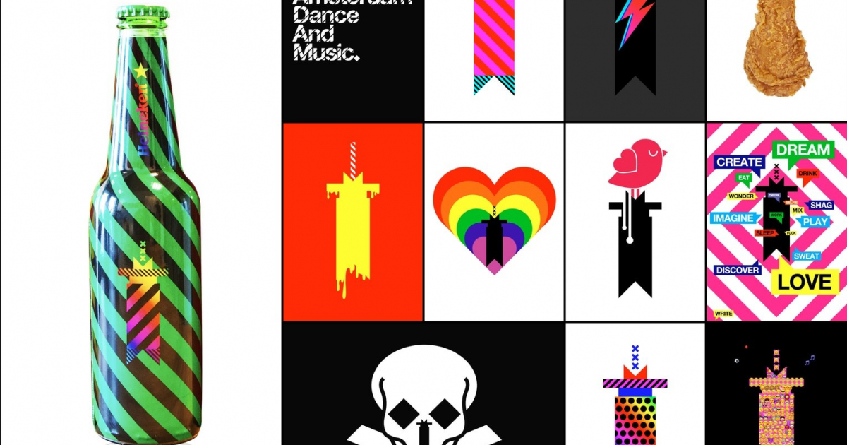
Importantly, A’DAM delivered real business value for the partners. The A’DAM brand helped to attract music giants Sony and Gibson (amongst others) as tenants to the tower – and also enabled lucrative brand partnership deals with KLM, Heineken and Rabobank.
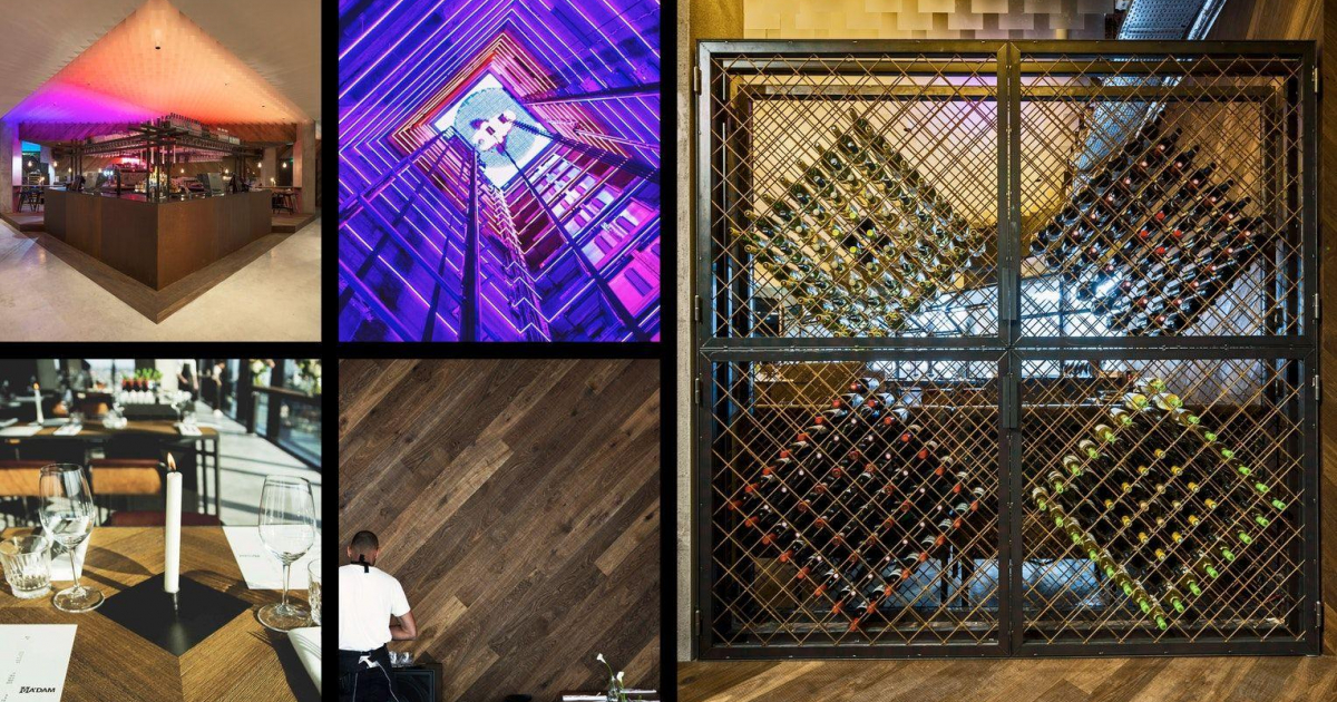
Today the restaurants, hotel and rooftop observation deck are a big hit with locals and tourists – and A’DAM Toren is firmly established as one of Amsterdam’s top attractions.
To convey the plans for the tower, we devised the name A’DAM: an abbreviation of Amsterdam & a self-created acronym for ‘Amsterdam Dance and Music’.
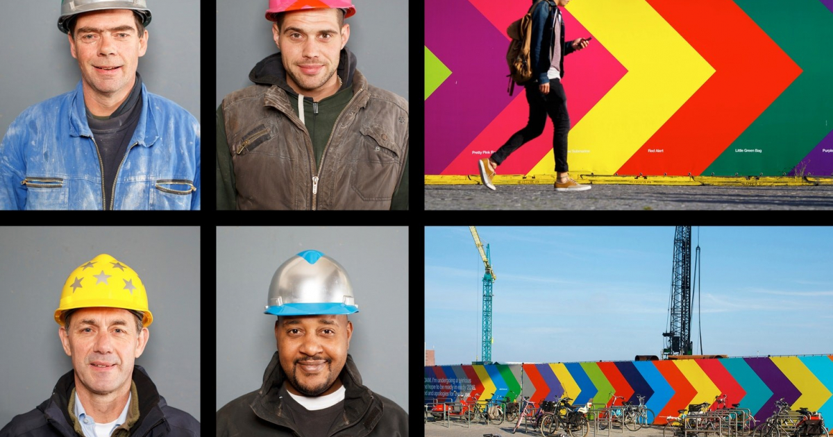
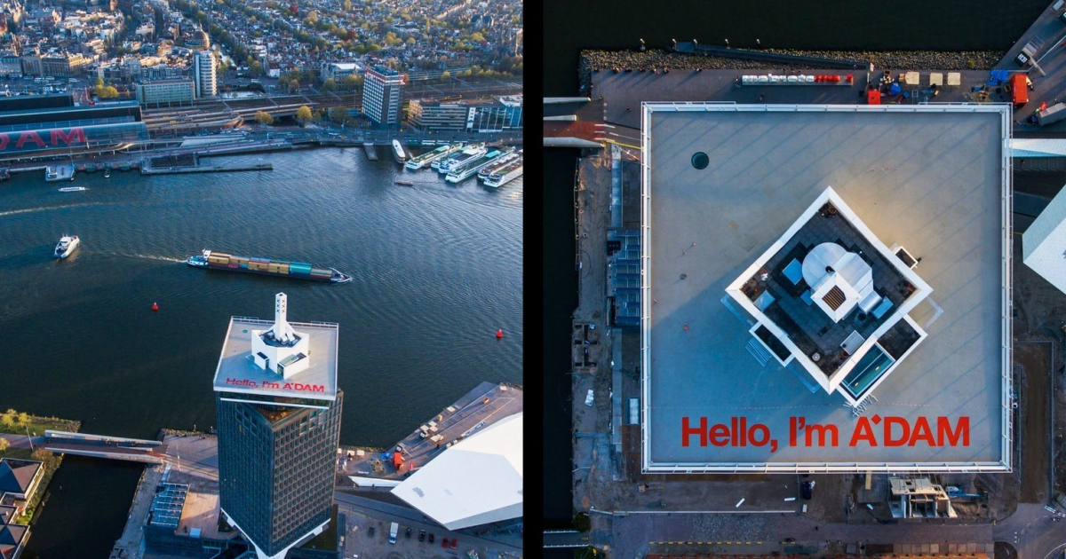
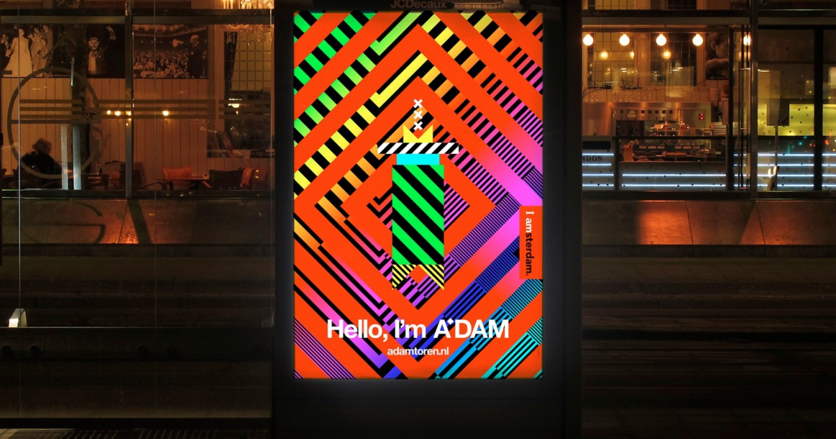
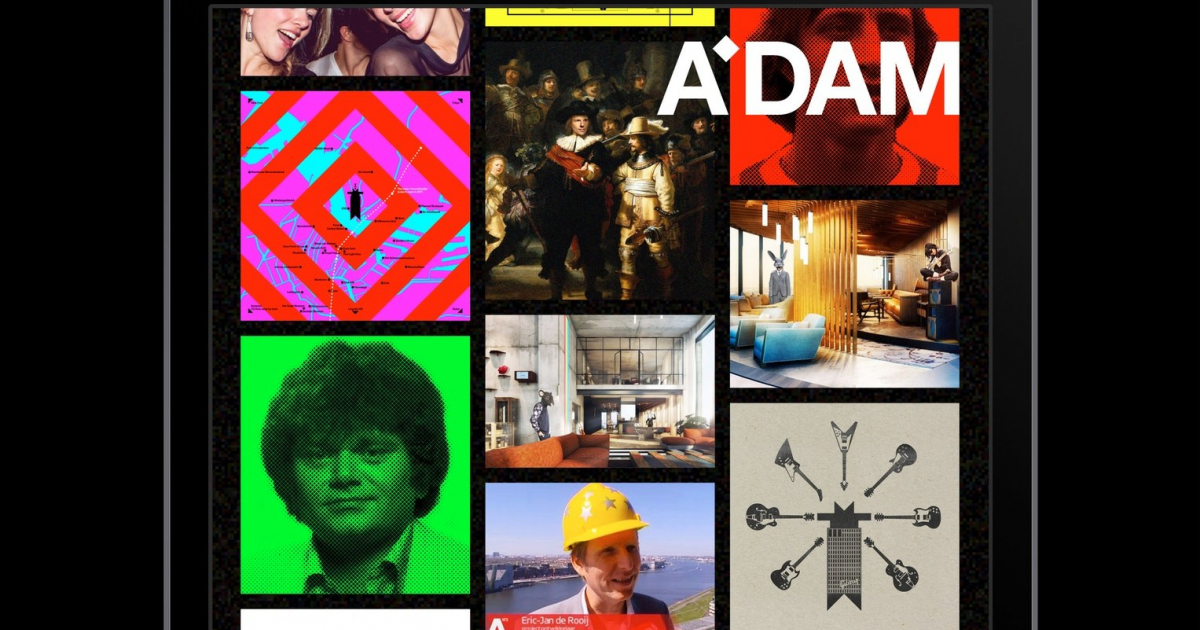
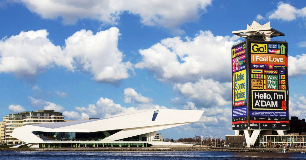
The A’DAM brand consists of a cheeky first-person tone-of-voice combined with bold colourful graphics. The visual identity is ever-changing but always recognisable through the consistent use of a bright colour palette, bold 45˚ lines, the typeface Helvetica & regular references to ‘music’ in the copywriting. This approach was first implemented on the gigantic building wrap which launched the brand with the slogan “Hello, I’m A’DAM”. This was then developed in engaging, fun & topical ways in Facebook over two years (Image 7+8). Even mundane items such as safety helmets & construction-site hoardings were injected with a music-inspired A’DAM attitude (Image 1+2).
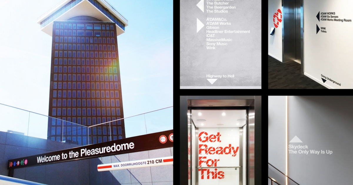
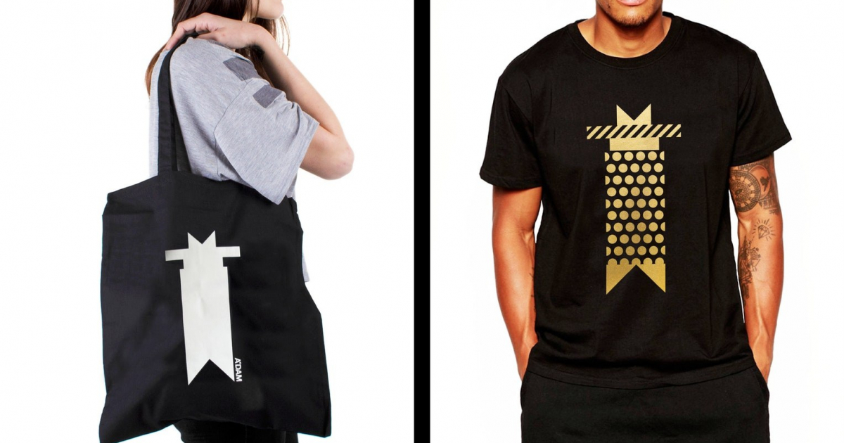
Since opening in May, the holistic approach to the A’DAM brand can also be seen in much of the interior design details (Image 9), the merchandise & the wayfinding which references well-known songs (Image 4).
Note: the A’DAM wordmark is set in Helvetica (a typeface that echoes the modernist architecture of Arthur Staal) and uses a 45˚square apostrophe to suggest the waterside position of the tower (‘Overhoeks’). This 45˚ square permeates almost every aspect of the brand identity.
We were asked to create a new name and the visual/verbal brand identity for the redevelopment of the Shell Tower (or Toren Overhoeks). The brief challenged us to create a buzz in the city – and generate brand value by attracting brand partners, prospective tenants and investors to the project.
The landmark tower in Amsterdam Noord was being re-developed by three pioneers in the music industry (ID&T, AIR & MassiveMusic). The three companies were going to be the anchor tenants and they had plans to fill the tower with a mix of music companies, nightclubs/bars and a hotel.
In short: create a new icon for Amsterdam and build anticipation and excitement over two years from January 2014 until the opening of the tower in May 2016.