Alfasan Naturally
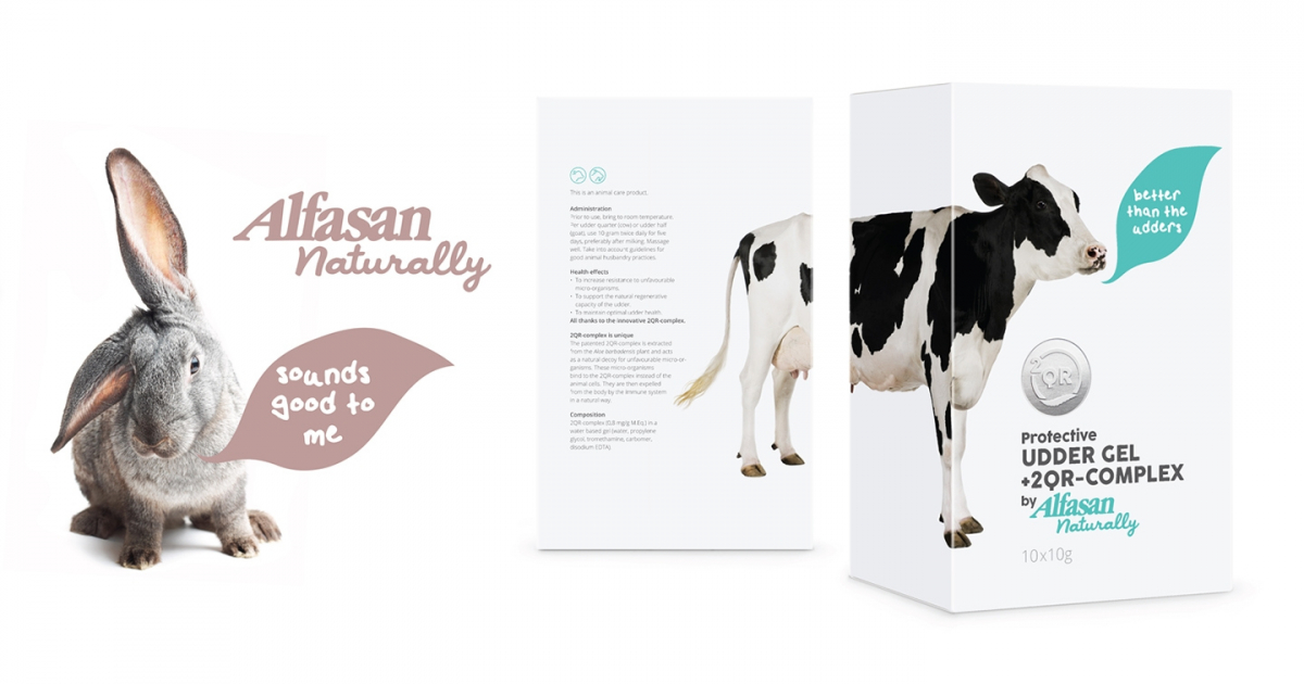
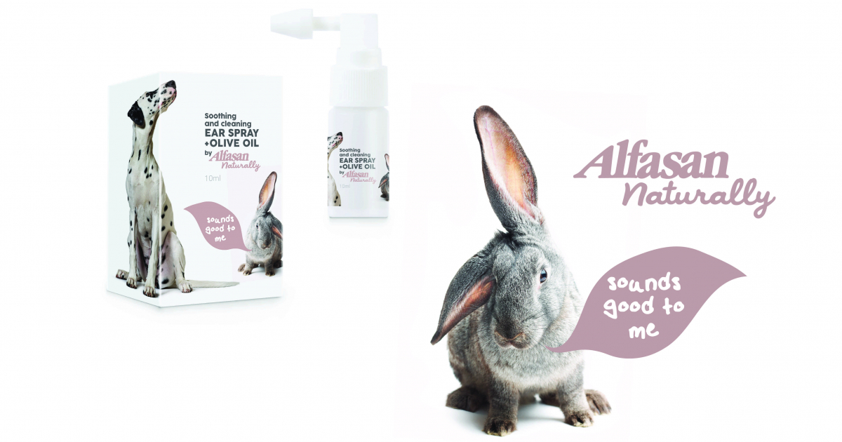
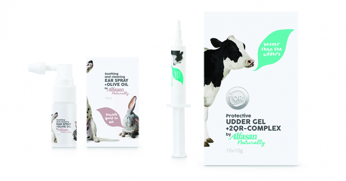
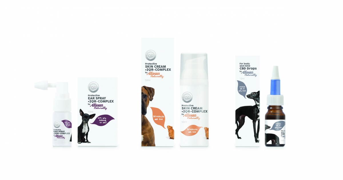
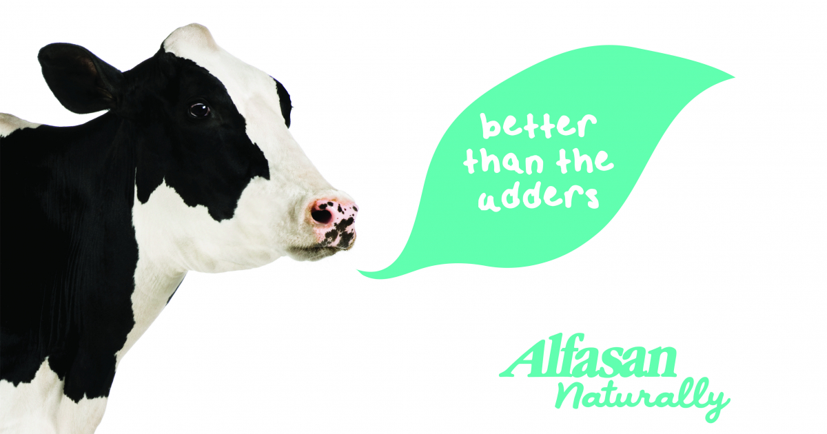
‘Alfasan Naturally’ brand big idea, the ‘leaf shaped speech bubble’. Iconic in shape, symbolising natural ingredients and voice of the animal. A rabbit with one ear raised says “Sounds good to me”, happy reference to product benefit to help hearing.
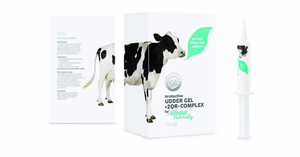
Choice for humor makes this quite unique in the health category which is traditionally very serious, often very boring. Finding a balance between factual information & playfulness without loosing confidence was key. The choice to have humorous text quotes from the animal highlighting the benefit of the product combined with just the right image make this concept so strong. Chosen name, ‘Alfasan Naturally’ was the perfect match to the brands positioning and to build on the already successful mother brand Alfasan. The play on the double mean of ‘naturally’ worked very well as not only making it clear that it is a natural line of products, but also that it was a ‘logical’ choice to choose for Alfasan, a brand with already 40 years of expertise. Logo changes colour to match compliment the animal on pack. Key information is kept functional and clear and same structure for all packs, but it is the copy writing in the ‘leaf speech bubble’ that is key to the strength of concept.
Concept makes this pack special. Big idea, the ‘leaf shaped speech bubble’ is iconic in shape symbolising the natural product and contains a product quote. The animal has a voice and communicates with humor the key benefit of the product. Carefully selected animal images, for example a rabbit with one ear raised saying “Sounds good to me” is the character for a product specifically designed to help hearing. Matt varnished white packs, metallic foil is use to highlight the brands premium and unique 2QR formula and text and leaf bubble are highlighted with spot varnish make this a special premium pack fitting the brand positioning.
Alfasan, producer of high quality veterinary medicines, available in 110 countries wanted to introduce a new premium line of animal health care products based on natural ingredients. Challenge was to create a name and brand identity and packaging for this new product range. Our challenge was to ensure a consistent and memorable brand identity which would be translated to wide range of products requiring diverse physical shapes, types and construction, all restricted to tried and tested safe packaging. In a market where so many health and medical products are either very function and lack character or story our challenge was to create a premium brand identity with character which would make a real emotional connection and stay top of mind. We wanted to avoid the clique of just putting a cute dog on a dog product.