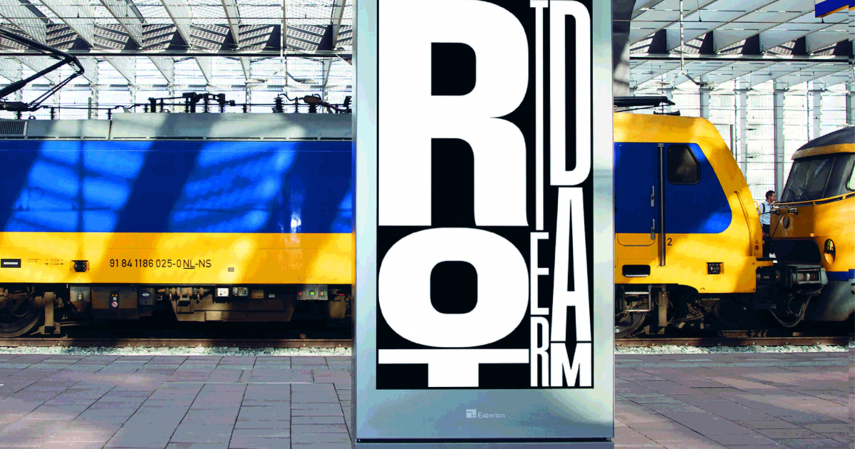
City Typography in Motion
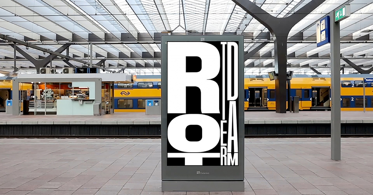
A variable typeface that adapts in any situation.
Very few applications exist of variable fonts because it’s still a new font technology. Font design, motion, graphic design and programming come together in a unique way. While it’s a complex technology the outcome looks conceivably simple and orchestrated.
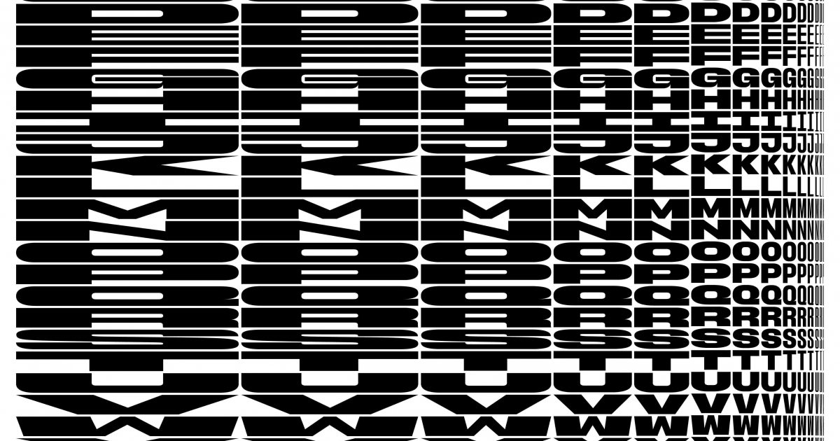
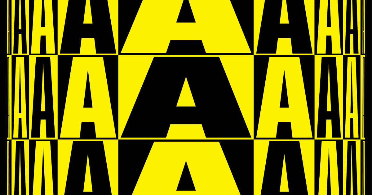
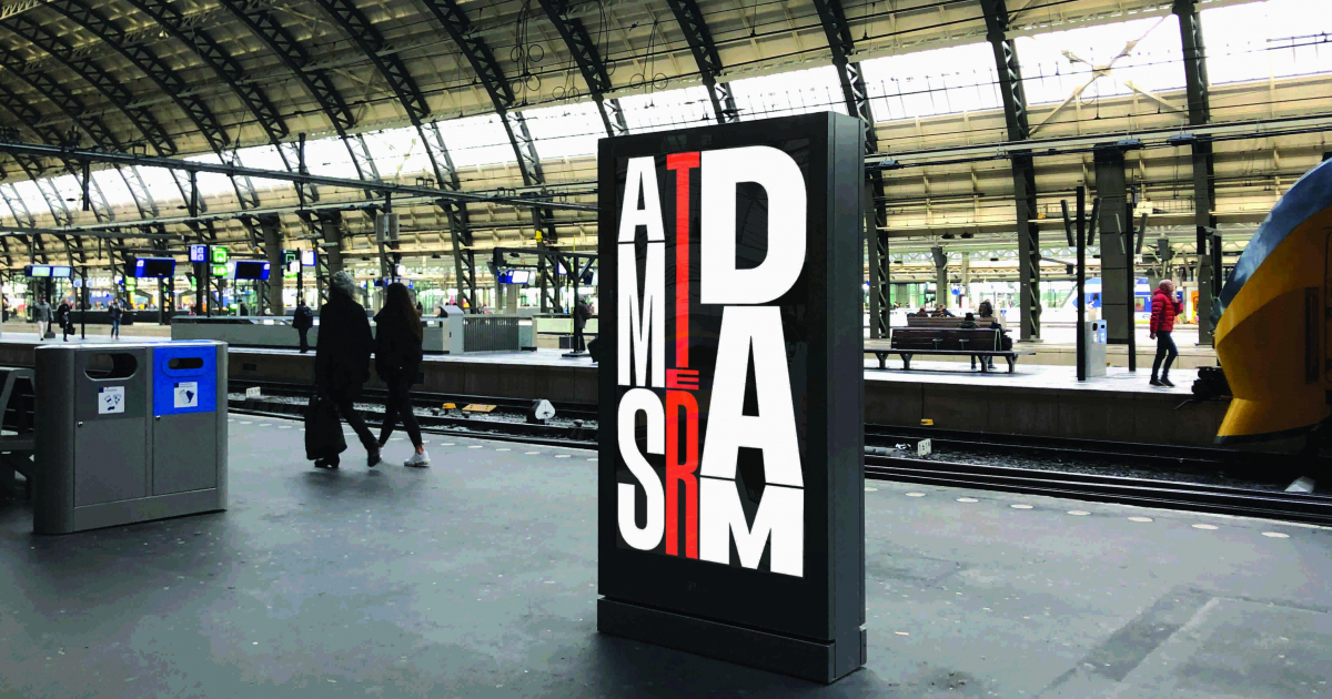
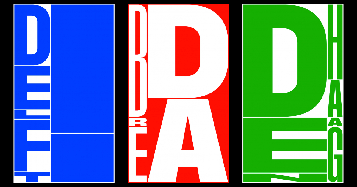
A custom made typeface was designed specifically for the screens. We made a variable type which changes according to a self developed script written in Python, DrawBot. The script animates every word you enter and gives it a dynamic character.
The grid is constantly in motion, the letters adjust to its changing framework perfectly. The typeface is unique because each letter is designed for every possible framework the script dictates. In this way the letters are not distorted.
This is a monospace typeface. Normally typefaces are designed for horizontal texts, this design is based on all directions. The developed script and typeface including interpunction, capitals and numerals, gives every word a playful and dynamic character instantly. It gives users the possibility to react on current events, you just have to enter the word Kingsday on april 27th and the motion is generated, ready to be played on every screen in the Netherlands during this festive day.
Design motion for the screens on the major train stations in the Netherlands. The motion should not be longer than 5 to 10 seconds using the simple idea of portraying the name of the city on the corresponding station in a fun and welcoming way making the arrival to a Central Station after a train trip a pleasure.
JURY FEEDBACK
TYPOGRAPHY / BRONZE
What made this case worth a bronze lamp is the fact that in essence it’s only typography that is used, but in a way that it combines multiple disciplines such as font, coding and animation.