Eurovision Visual Identity 2020
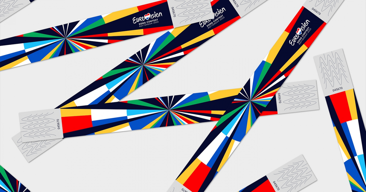
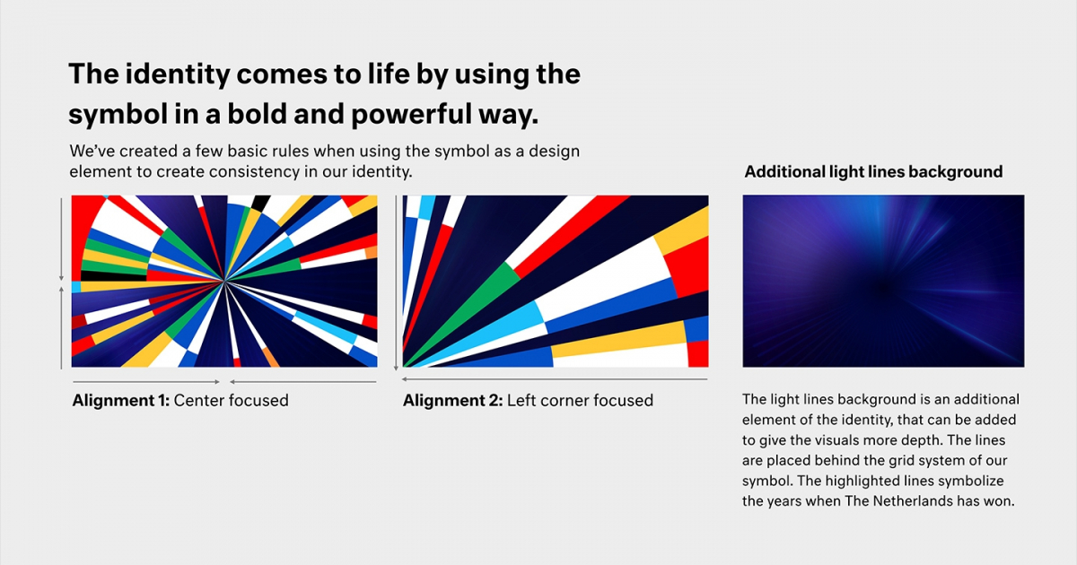
The contest started 10 years after the end of the Second World War, as a way of helping to unite Europe through music and creativity. To emphasize this message, we have developed a data-driven identity that honors the history in a contemporary way.
With Britain leaving the EU and political opinions within the EU becoming more and more polarised, the need to unite and celebrate diversity within Europe is becoming bigger and bigger. Eurovision wants to bring together countries with creativity, showing a part of their culture and celebrating it with music.
Our identity showcases this idea of coming together to celebrate each other and uses the different flags to give colour to the contest and Europe.
The symbol shows that you don't have to use the traditional visual language of an entertainment show, nor traditional dutch icons, but you can use an abstract design to create something that is both meaningful and festive, that sets a new standard for TV entertainment.
The Contest started 10 years after the end of the Second World War, as a way of helping unite Europe through music and creativity. Since it began with 7 European countries, the competition has gone out of its way to embrace new cultures and new talent. Today it welcomes 41 participating countries.
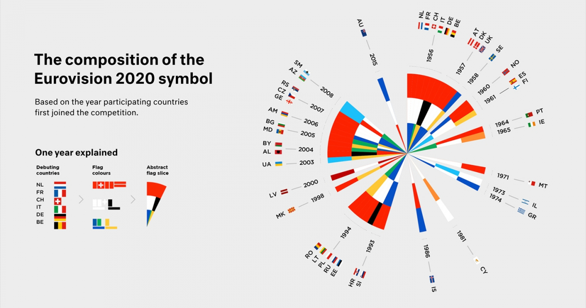
To emphasize this message, we developed a data-driven visual identity that honours the history of the Song Contest in a contemporary way. By using software that we developed ourselves, along with historical data, we were able to design an iconic visual identity.
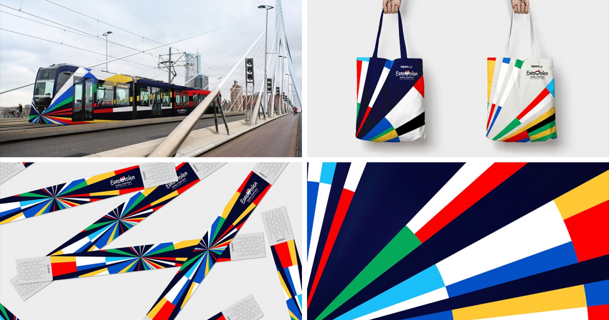
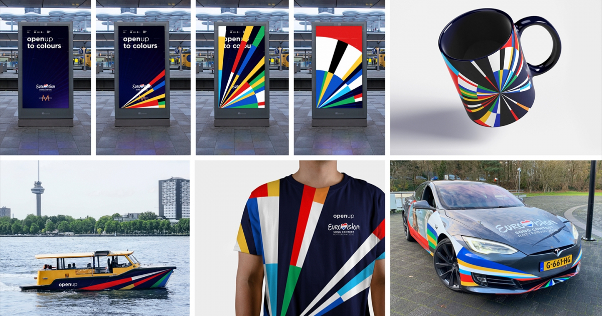
This identity is bold and can be applied in many different ways. Behind it, there is a story which complements the theme of Eurovision 2020, ‘Open Up’.
We tied our design to this theme in both static images and motion by connecting the flag colours of the participating countries, opening up through time and creating a unified, yet diverse feel that celebrates the 65th anniversary of the contest.
Create a visual identity that must be complementary to the generic Eurovision Song Contest logo. Ingredients to work with: "Open" for everyone, innovative, creative, music-related and a "leap forward", in which the Netherlands embodies itself and surprises Europe.
Jury Feedback
DESIGN – BRAND / SILVER
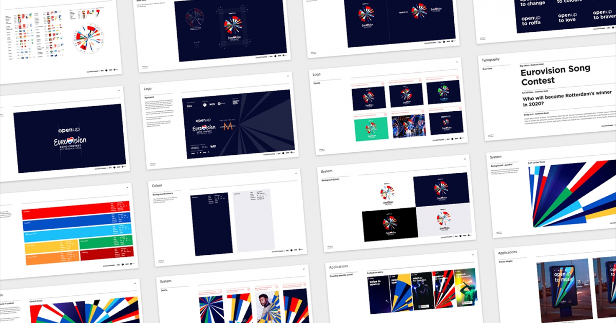
Clever Franke used data to create a very clever design system (pun very much intended). This creates a rich, intelligent, flexible, and visually accurate representation of the participating countries within the Eurovision contest. Innovative, colourful in approach, whilst echoing vales of unity, inclusivity, and simplicity align perfectly to the Dutch design aesthetic and sensibilities. This simplistic and flexible approach allows every brand touchpoint (from print to motion) to be well crafted, consistent whilst perfectly retaining the sense of global entertainment and spectacle.
The jury praised the approach of the design commissioners who demonstrated boldness by choosing a data-driven design and technology company (especially within the delicate political challenges). It’s just a real shame the event didn’t take place.
DESIGN – GRAPHIC / NOMINATION
The designers have researched various data sets that could feed the identity of the Eurovision Song Contest, its history and the European idea. The result is an interesting, visually appealing, complex and holistic design. The jury finds it special that the designers were able to connect their own research and self-developed software to the design and thereby function not only as designers, but also as content creators. Douze points.