FANTASTIC NORMAL JOBS
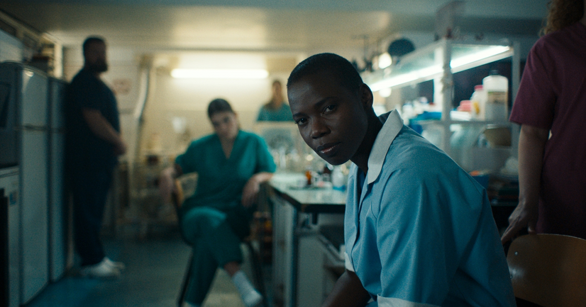
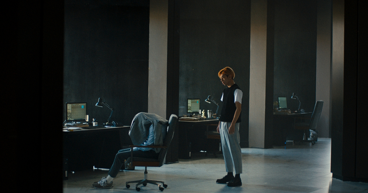
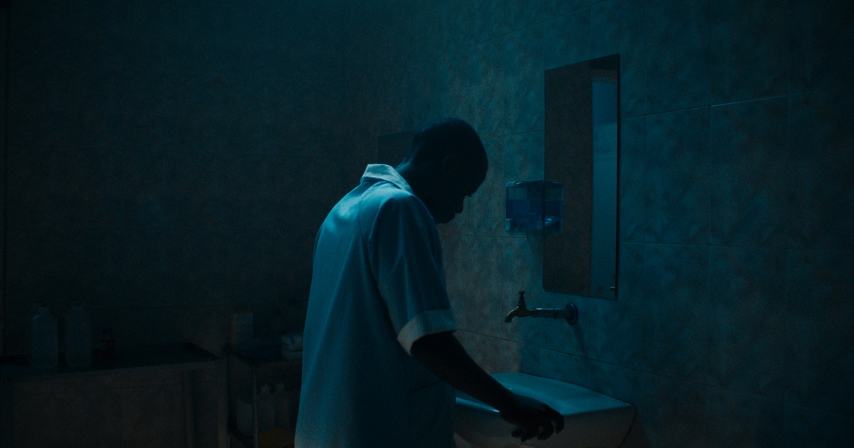
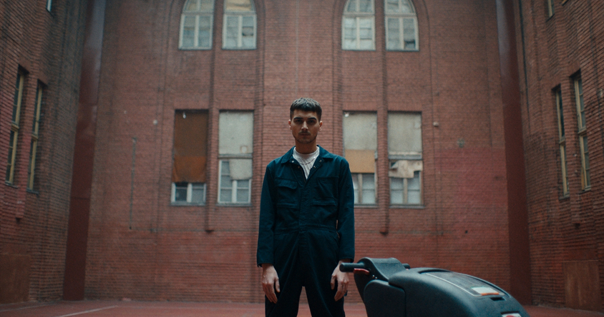
For crying out loud, not everyone wants to be an influencer or lifestyle photographer. Most of us have real jobs that pay the rent. We can all find pride in that. In this campaign, we see how Jobbird.com has got over 100,000 fantastic normal jobs.
Relevancy - Photography
Just three words, fantastic normal jobs gave guidance and tone to everything. We think this fantastic normal photography.
Relevancy - Editing & Film Direction
We wanted to make normal look fantastic. The commercial was cut like a Netflix trailer of a new serie with 'normal heroes'. The editing was key for the cinematographic approach.
Relevancy - Cinematography
We wanted to make normal look fantastic, cinematographic and epic, cause that was the core of the idea.
Idea/Craft - Photography
We wanted it to look fantastic and normal at the same time. Raw, but sophisticated. Simple, but special. Bold, clean, beautiful.
Craft / Execution - Editing & Cinematography & Film Direction
We didn’t look at other advertising as a reference or inspiration, but at high-end Netflix series and movies. We wanted it to look and feel very cinematographic. The characters and their work should look normal and fantastic at the same time. That is always hard to sell in advertising, cause it means a lot of blacks and shadows, and indirect storytelling, while most of the advertising is bright, open and plain simple. Luckily enough, we had a client who understood the concept and was willing to work with the outspoken consequences.
In an era when everyone has to be extraordinary and wants to become an influencer or travel photographer, this campaign pays homage to normal, everyday work. Fantastic normal work. We wanted to make the normal jobs look and sound fantastic, but keep it raw and real at the same time.

Jury feedback
CRAFT - PHOTOGRAPHY / NOMINATION
Progressive to choose such a simple form. Application; the way in which the portraits connect to the entire concept, for example to the typography. Strong cast, international, could feel 'local' around the world by the cast. Direction; cast is very confident in the image, fits in nicely with the concept in which the 'normal jobs' are placed on a stage. Use of colour is good, consistent. Put down with little, not too overstyled, we think this is strong as a jury. Series makes it stronger, a wider selection would have made more impact. Contemporary. Less is more, keep it simple, we could learn from this. Simple, tasteful image. Striking. Creative, get thinking.
CRAFT - EDITING / NOMINATION
We like the film and give it a nomination in different categories. Only this time we though editing was not its much stronger side.
CRAFT - FILM DIRECTION / NOMINATION
The film delivered so well the script (irony is hard to translate, this one does that very well) but couldn’t get any better than a strong nomination as it didn’t stand out among the next step of films in competition. Strong nomination though.
CRAFT - CINEMATOGRAPHY / NOMINATION
Everybody loved the work, but it narrowly missed out on a Lamp.