Klik!

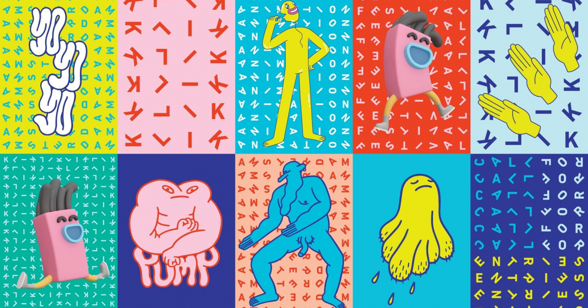
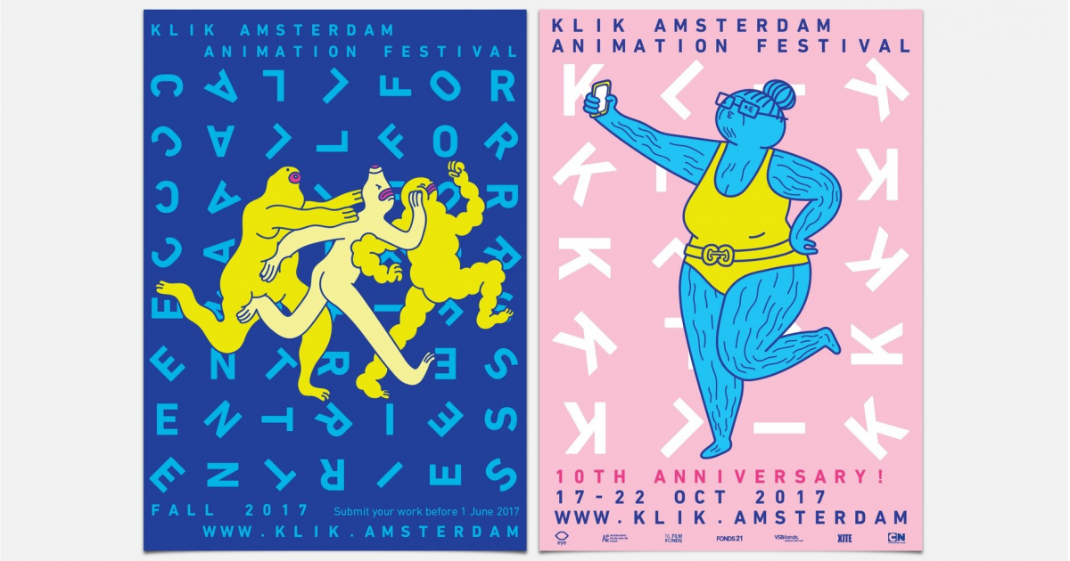
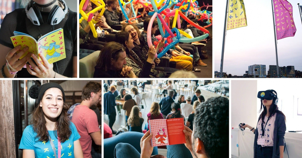
When a festival celebrates animation, you want the visual identity to celebrate along. The fundamental principle of animation is quickly changing static frames. This idea of constant movement became the base of the identity.
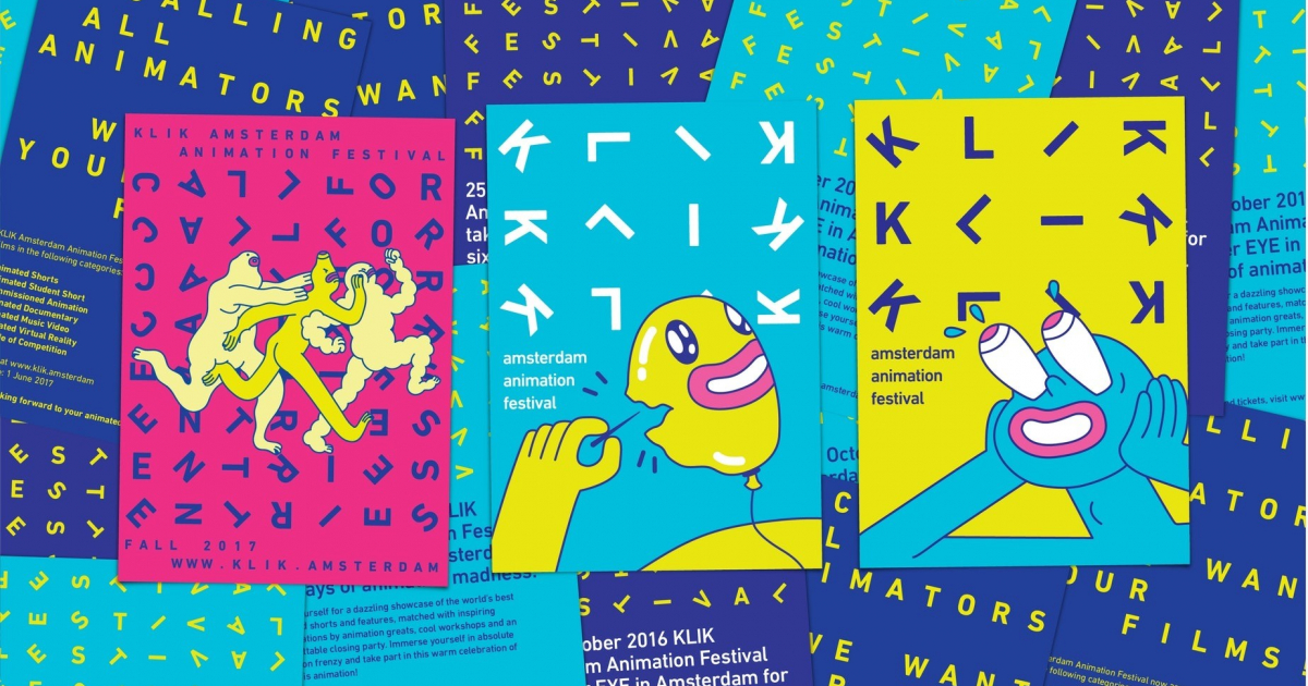
Throughout the entire identity, movement is key. Typography dances, trips, tumbles and whirls. An atmosphere that goes well with the vibrant festival.
The festival goes completely loose with animations, crazy installations and moving objects. The graphic identity represents that movement and gives an animated feeling, even in a static way. The strong graphical look and vibrant colour pallet represents the crazy and fun festival vibe.
INSIGHTS
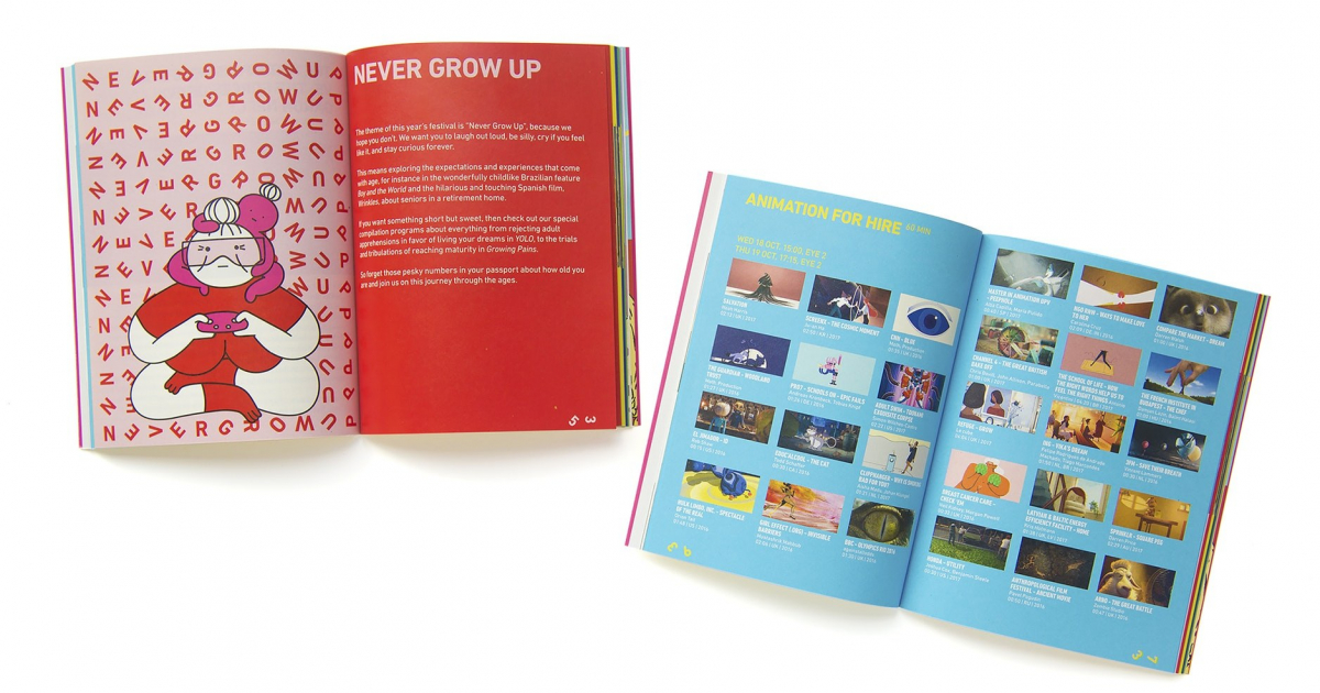
Part of the assignment was to make an identity that could be combined with different styles of illustrations, 3D graphics or even photos. So far, we collaborated with illustrator Aisha Madu. The strength of the identity lies in its simple yet clever and communicative principle as well as the ability to adapt. The principle of the logo also works in the smallest details, for example, the page numbers of the program booklet creates animation when you flip the pages. The secondary type treatment principle does not have a rotation but has wide monospacing, that also refers to the same film frame principle where each element is in the centre of a frame.
KLIK Amsterdam Animation Festival is an annual celebration of all that is animation. The festival strives to stimulate the Dutch animation sector and provide it with an international showcase. We were asked to create a new visual identity.
