MOYO® Your Natural Sweets

MOYO® is a new brand from Looye Kwekers offering premium and healthy snack tomatoes for kids. OD Designstudio and FLEX/design joined forces to develop a successfully integrated packaging solution, which will stimulate children to eat more vegetables.
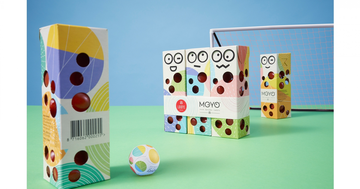
The MOYO premium tomatoes for kids create a unique proposition in a crowded category. The small 80-gram snack packs have a handy dispenser and come as a 3-pack in stores. Both the structural and the graphic design tell a playful brand story that is ground-breaking within the tomato category, where the general category focus is on functionality, freshness, and product visibility. The new MOYO packaging immediately stands out on the shelves dominated by transparent plastic packs. They are a cheerful and happy newcomer in this functional category.
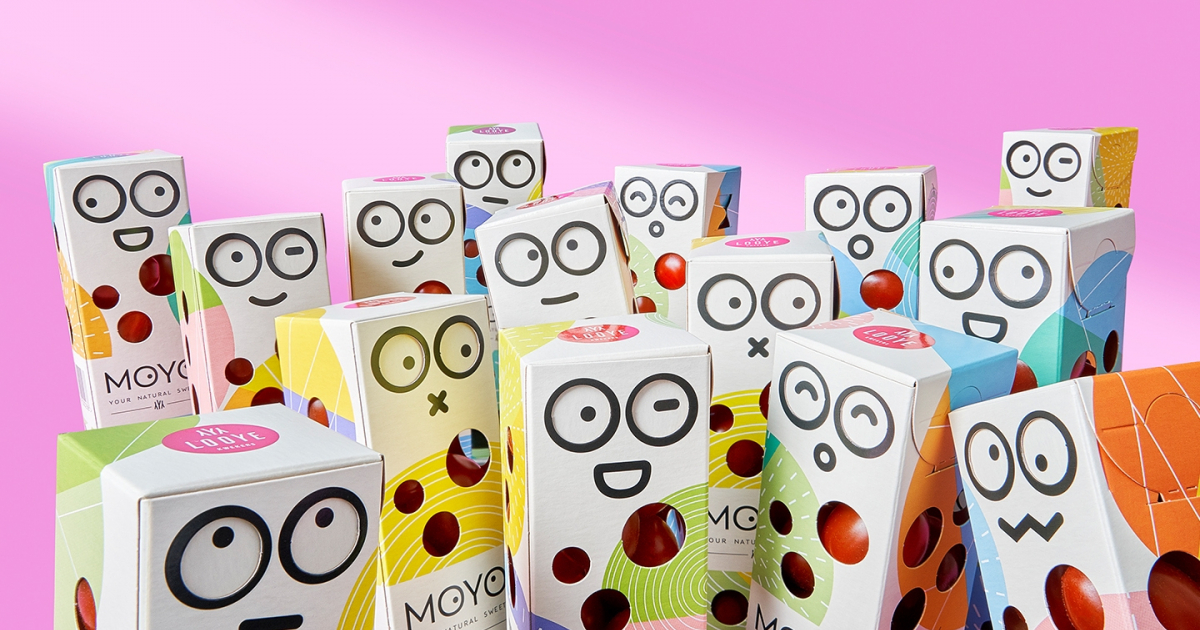
Zooming in on the packaging, the design team created an optimistic and playful identity that is attractive for kids to have and to use. By adding the dispenser top and using emojis for kids to use and play with, the team created an interactive packaging containing healthy and tasty snacks kids can relate to and have fun with.
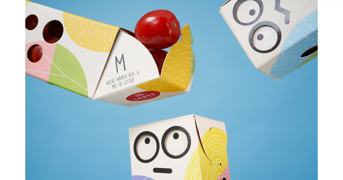
OD Designstudio and FLEX/design joined forces to develop the structural packaging and brand identity for MOYO. The central idea behind the packaging is to offer an inspirational portion pack for on the go made of sustainable cardboard. By creating round shaped cut-outs in the playful pack, the bright tomatoes are visible for both kids and parents. A playful idea is the use of the lid as a dispenser. It makes it easier to enjoy the snack alone or share with other boys and girls, and family.
Especially for kids, the designers came up with an element that is not only convenient but also playful. The dispenser lid and the graphic design tell an integrated story appealing for kids. An emoji is part of the graphic design. By opening the lid, the emoji changes expression. There are 12 different playful designs for the packs with an equal number of different emojis, and as a small extra, there is an educational question hidden in the top.
Looye Kwekers is one of the Dutch high-end tomato growers with premium brands Honeytomatoes and JOYN. With the addition of MOYO to their portfolio, Looye introduces a new brand, offering tasty snack tomatoes, especially for kids. These mini plum tomatoes have a sweet taste, delicate structure, and bright red colour: perfect for kids!
The briefing was to come up with a brand concept that stands out on the shelf and at the same time, is attractive for kids. The idea was not to use any plastic, though clearly showing the tasty snack tomatoes. Transparent packaging dominates this category to show tasty, fresh products. We were challenged to rethink and realize a packaging solution that puts the focus on the fresh premium tomatoes, while at the same time create a playful world for kids. The combination of both determines the creative success of the new MOYO packaging and identity.
Jury Feedback
DESIGN – PACKAGING & PRODUCT / BRONZE
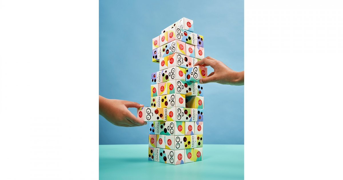
The innovative look and application to the promotion of the healthy snack for the youth, which in addition to the healthy points of view also acted on the creativity and fantasy of the youth immediately attracted attention. The game element, the encouragement of individualism and the different emotions made this entry stand out. Playful, lighthearted way to introduce tomatoes to kids. It feels new and has an element of surprise, something innovative, memorable when kids interact with it. On the one hand a design that children like and yet retains the high-end premium feel of the brand. No standard q’s like Disney characters etc. A design which is new on shelf and you can play with. Alone or with your friends. Like Jenga or football. Playful, well designed & executed, hit the goal/brief.
The packaging is functional but adds something interactive to it which makes it fun and memorable and most of all motivates kids to eat something good. The added value of humour, play and reusable packaging makes this entry the winner of a Bronze Lamp. It is well designed and stands out within its category. It fits the brand approach. Stylish and fun together. Creative and witty solution, well executed overall package.