Nederlands Theater Festival
Nederlands Theater Festival yearly brings together the best of Dutch and Flemish theater. With a fresh and playful tone of voice, the festival invites its audience to reflect around the diverse themes that are depicted in the plays.
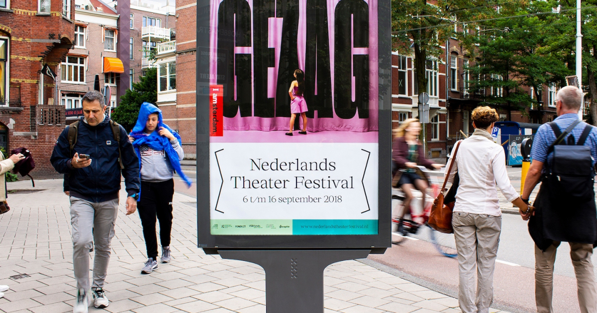
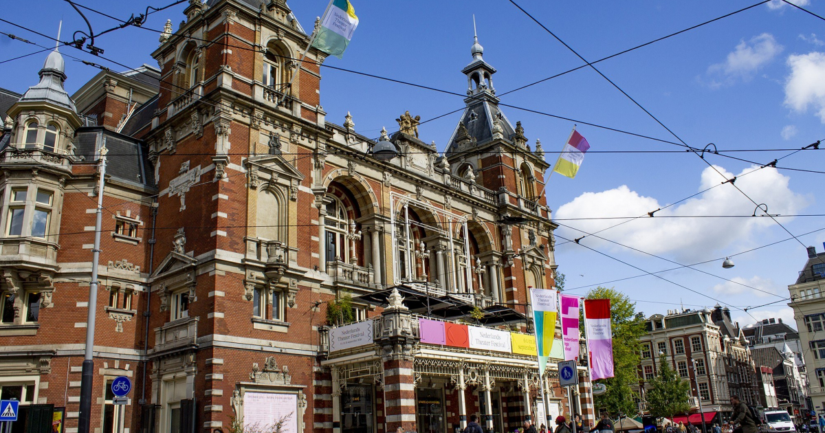
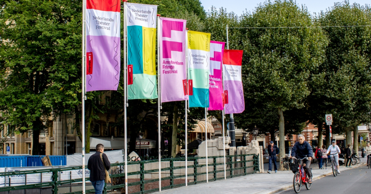
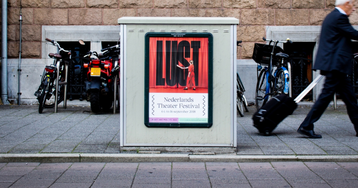
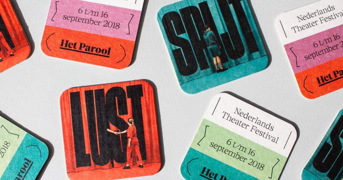
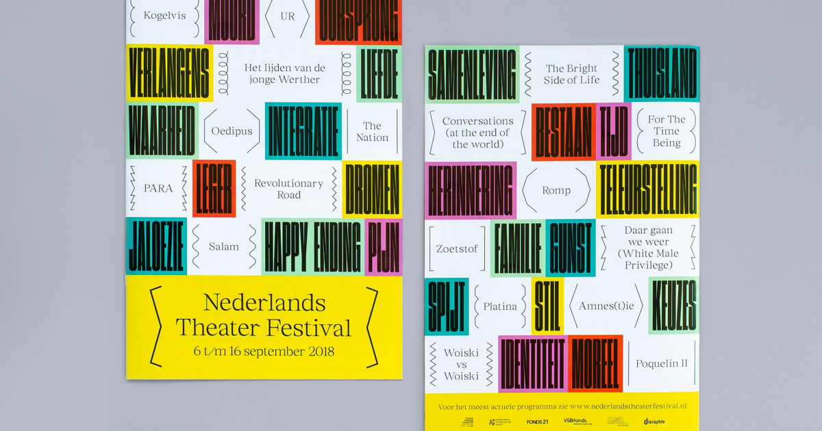
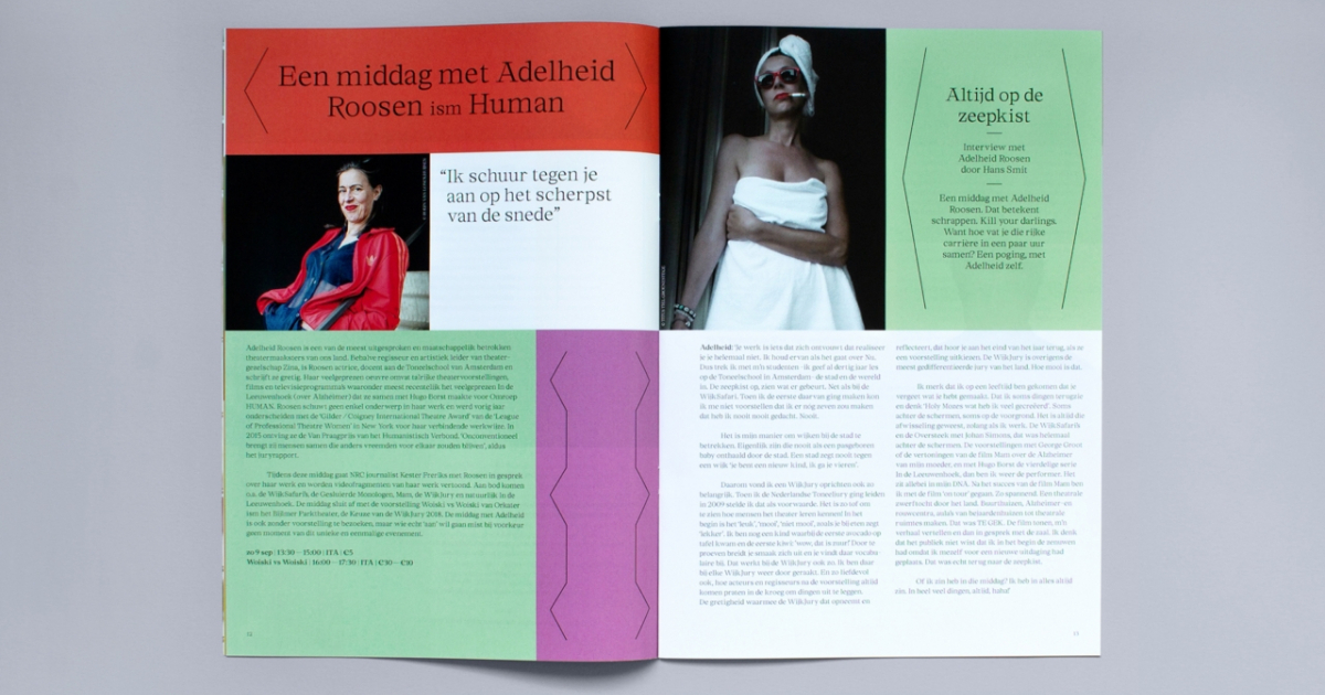
The campaign shows how the festival aims to get the public introduced into various specific themes, while it works for targeting different audience profiles. With this conceptual and photographic approach, we represent the playful tone of voice that the festival has behind its invitation for the audience to reflect around big existential themes. The photography concept is extended with a purely typographic approach in other applications such as the program book, in which themes such as 'Integratie' or 'Dromen' are featured, among many other topics. Both the campaign and visual identity were widely implemented across the city of Amsterdam with posters and flags, printed magazines, coasters, newspaper ads, theatre dressing at ITA and Theater Bellevue, as well as in online media such as NTF’s website, social media channels and digital banners. This edition of Nederlands Theater Festival has been a great success, most of the performances having been sold out.
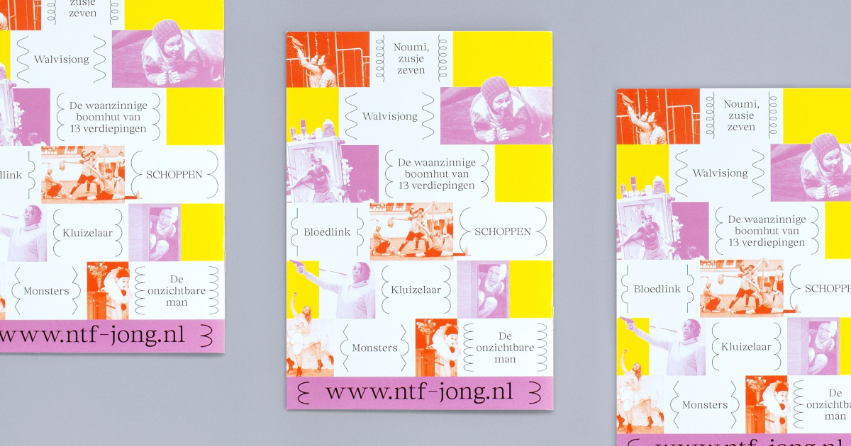
We also created a sub-brand for the youth program (between 2-14 years old): NTF Jong. The contents of this part of the festival are presented with a child-appealing style, using monotone pictures of the performances and collage cut-outs that emphasize key objects of the plays and body parts of actors. For NTF Jong, we also narrowed down the use of 'frameworks' of the visual identity, to the most curvy and rounded shapes, and selected the warmest and brightest colors from the palette.
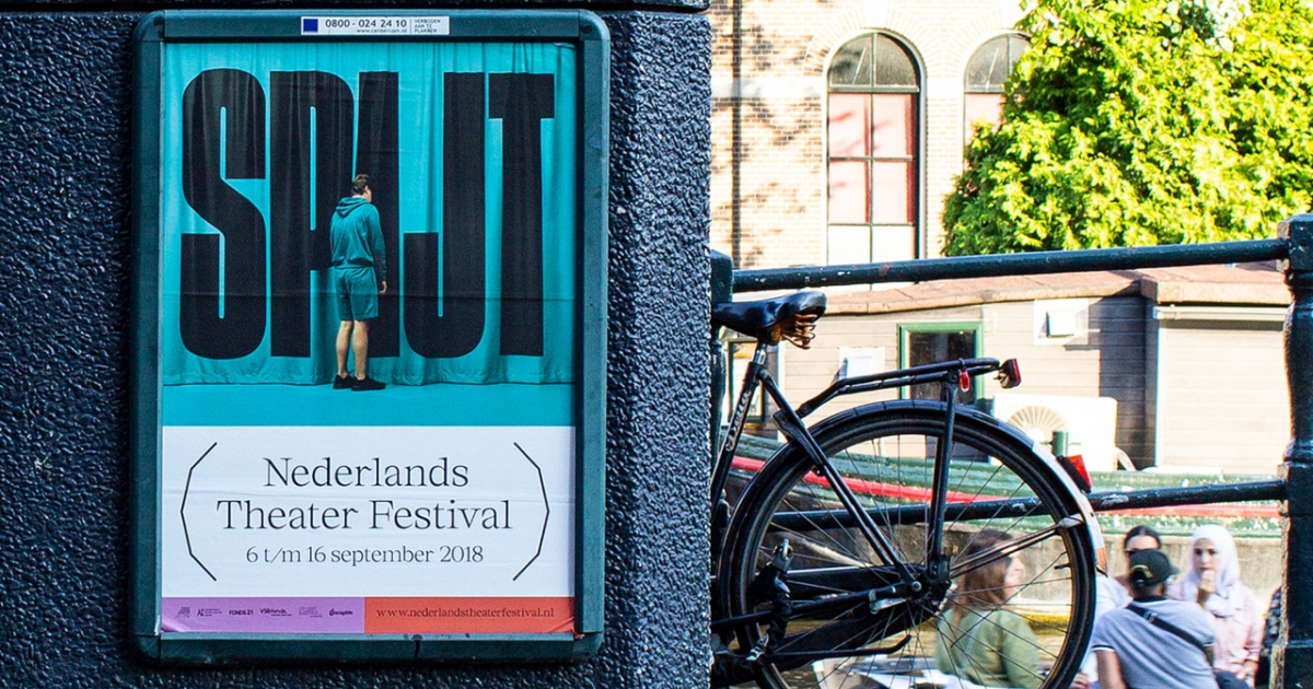
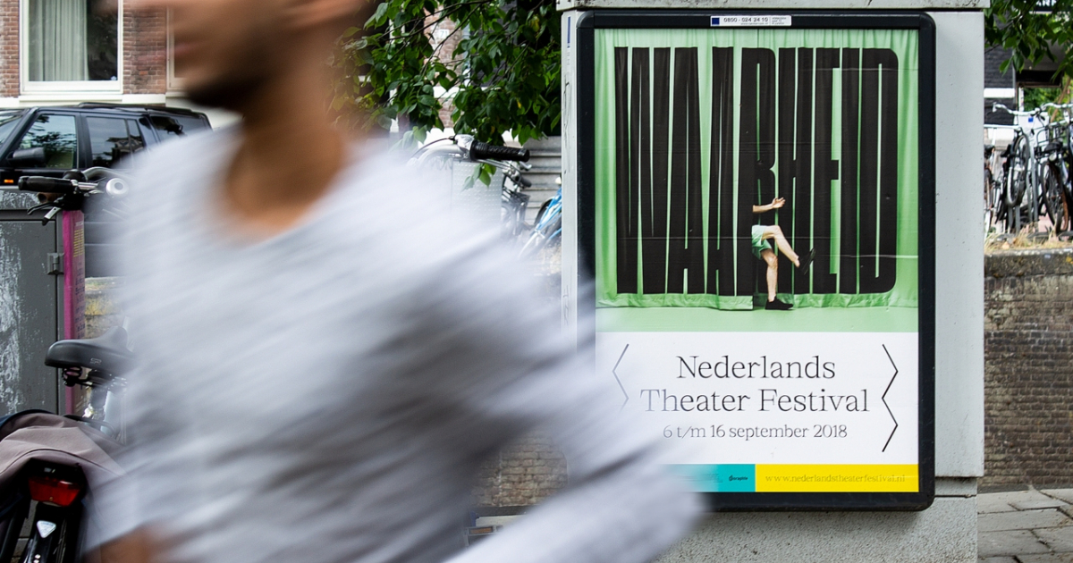
We made a selection of the key themes in which the audience would be introduced to in this edition of the festival, and created a photographic campaign series depicting people literally entering these themes through theatre curtains. Someone accidentally falls into ’Waarheid’, a young girl confronts ‘Gezag’, an unenthusiastic guy peeps into ‘Spijt’, someone pulls a woman into ‘Lust’. In order to refresh the visual identity of the festival, we devised a flexible visual system consisting of a broad set of 'frameworks' that represent the many different discourses and plays presented at the festival, while these work as symbols of open theatre curtains. Next to communicating the diversity that can be found at the festival, the flexible visual system helps introduce the different contents of the program.
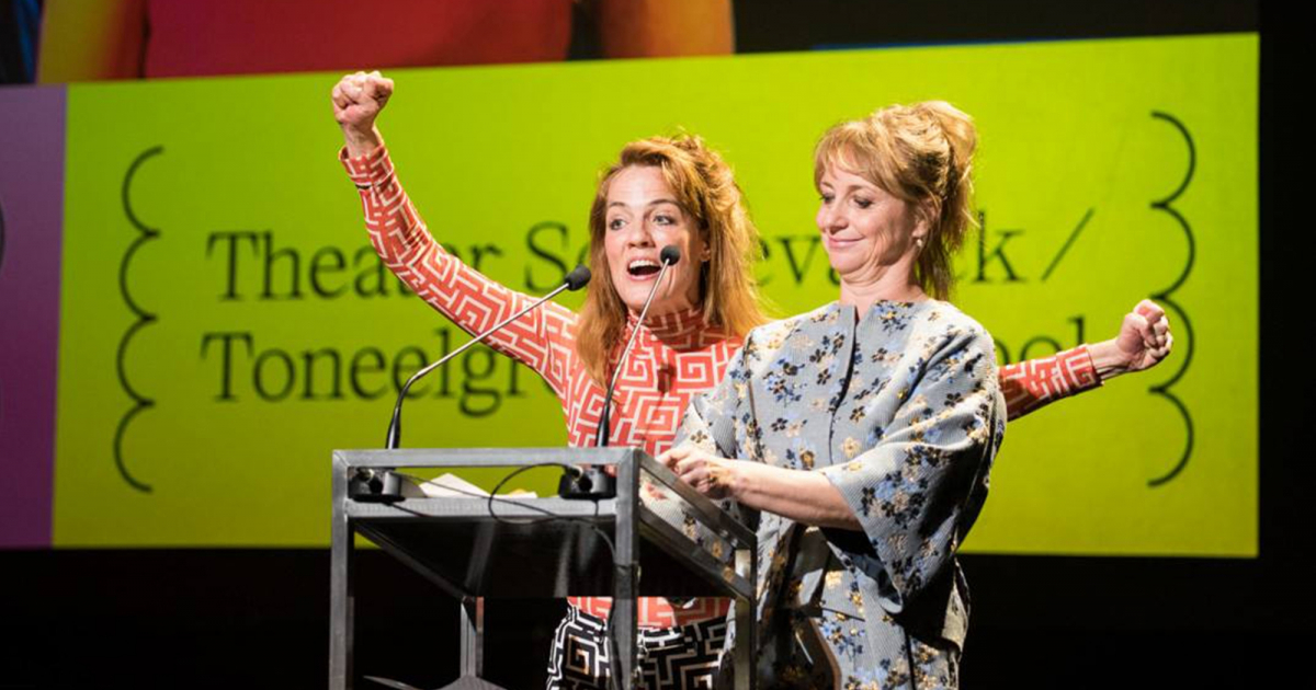
Nederlands Theater Festival yearly brings together the best of Dutch and Flemish theatre, and hands out awards for the best actors and performances of the year.
The festival wants to take the lead in the debate on the role of theatre in our society. For this year's communication campaign, the festival wanted to highlight how the theatre plays will immerse the audience into different themes and make them reflect around these (often existential) topics.
Despite this reflective attitude, the festival in its whole should be perceived as a fun and inviting event with a very diverse program.
Alongside the campaign, it was possible to consider whether the visual identity should also be redesigned into a more fresh and up-to-date identity, that represents the festival's mission and diversity.
JURY FEEDBACK
BRAND / BRONZE
Bold, fresh, surprising, different touchpoints, communitactive, accessable.