Rijksmuseum Boerhaave
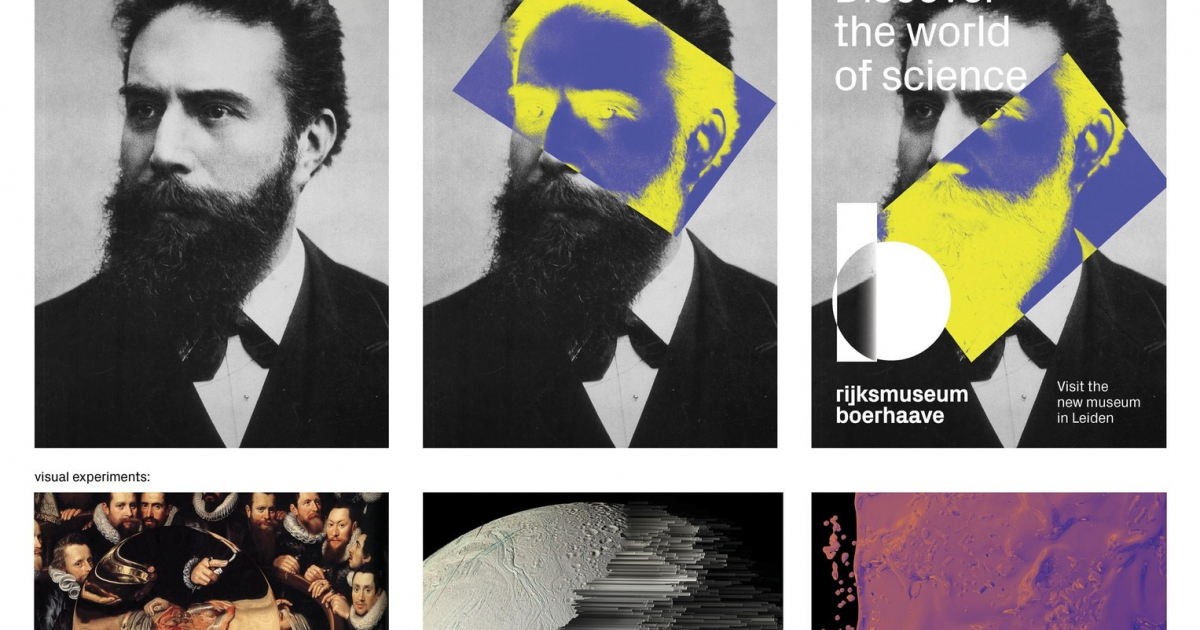
As a museum, which stories do you tell? Which type of visitors are you targeting? What is your distinctive character? We investigated these type of questions together with the museum to distill a strong brand essence. With a collection spanning five centuries of research and innovation, the museum has many subjects to share and stories to tell. We responded to this challenge with a visual style which supports versatility, whilst remaining recognisable to the public before, during, and after visiting the museum. The logo is a combination of two mathematical shapes: a circle and a rectangle, forming a robust lowercase ‘b’. The space where the shapes intersect represents the research-like character of science, allowing for a variety of reactions. The scientific processes and the research attitude of looking differently are conceptualised in visual experiments. The use of 3D software allowed us to cast new light on a variety of themes, transforming, distorting and converting imagery.
INSIGHTS
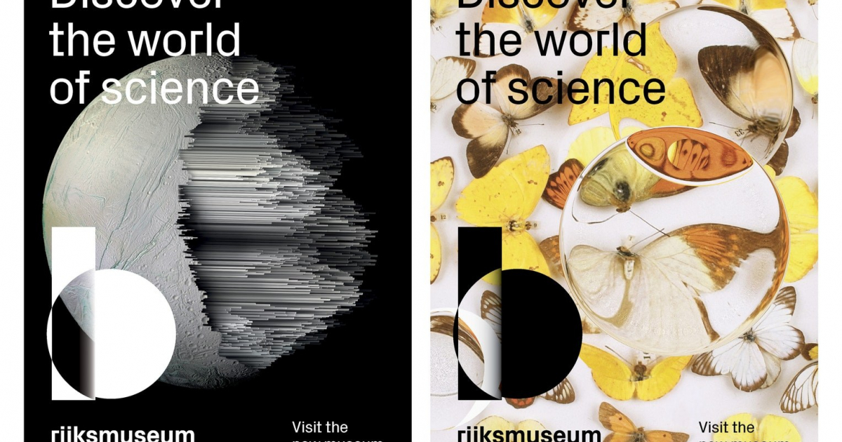
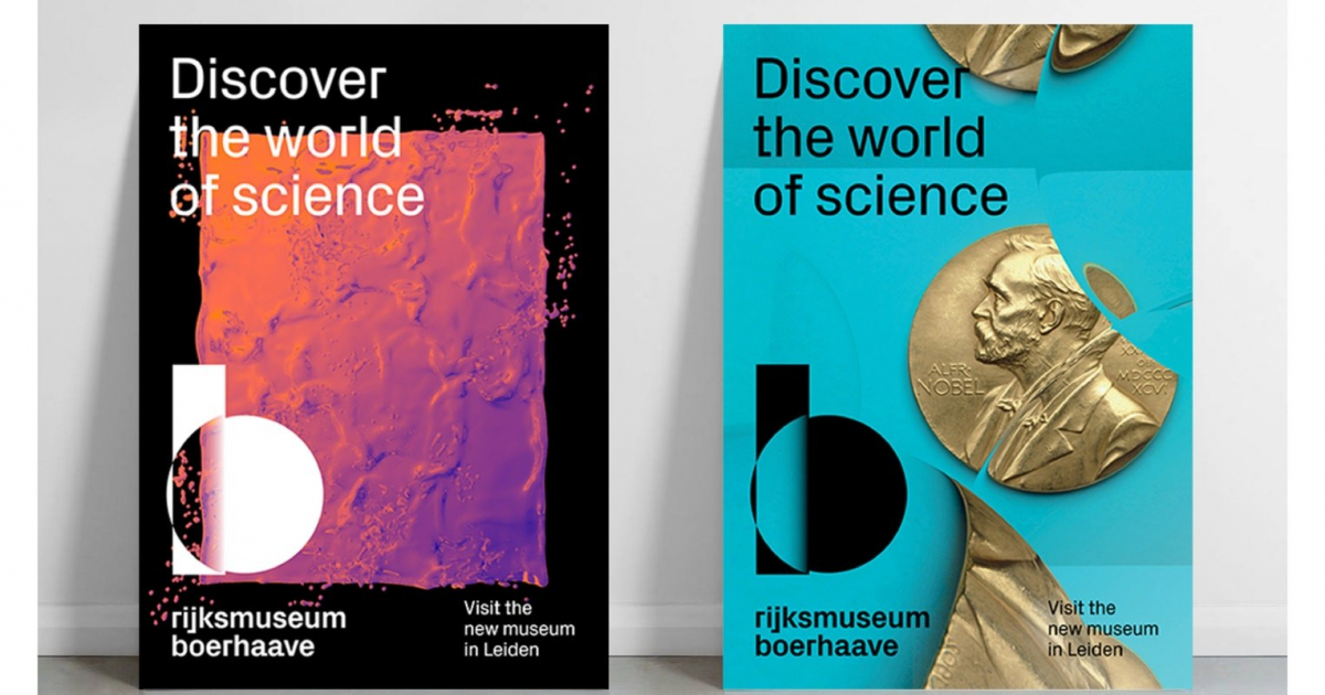
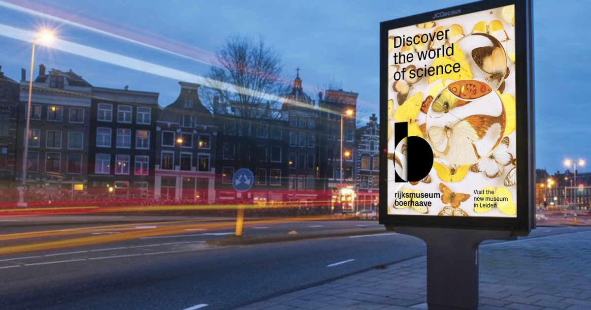
Based on the early numbers after the reopening, Rijksmuseum Boerhaave’s ambition to attract a wider audience appears to be realised. The public campaign “Discover the world of science” is a successful first implementation of the brand identity.
Rijksmuseum Boerhaave’s rich collection shows the major discoveries in the history of science in the Netherlands: it’s a treasure chamber of science and medicine. In 2016, the museum closed for a large-scale renovation project. The exhibition spaces were reconfigured, presenting the collection in a thematic fashion and incorporating interactive experiences. The museum also changed its name: Boerhaave became a Rijksmuseum - a national museum. This expressed its status more clearly: it's a museum for all of us. The opportunity was used to innovate the brand strategy, supporting the museum’s ambition: to appeal to a wider audience and attract more visitors.