Royal Academy of Art & Royal Conservatoire The Hague

We found a common ground in their process-based approach (life long learning), reflecting what it means to study visual and performance art. ‘Try again, fail again, fail better’ as Samuel Beckett put it.
Since the Academy and Conservatoire are entitled to use the predicate 'Royal' – a unique selling point, also international – we decided to use a crown as main element in their identity system to visualize this attitude.
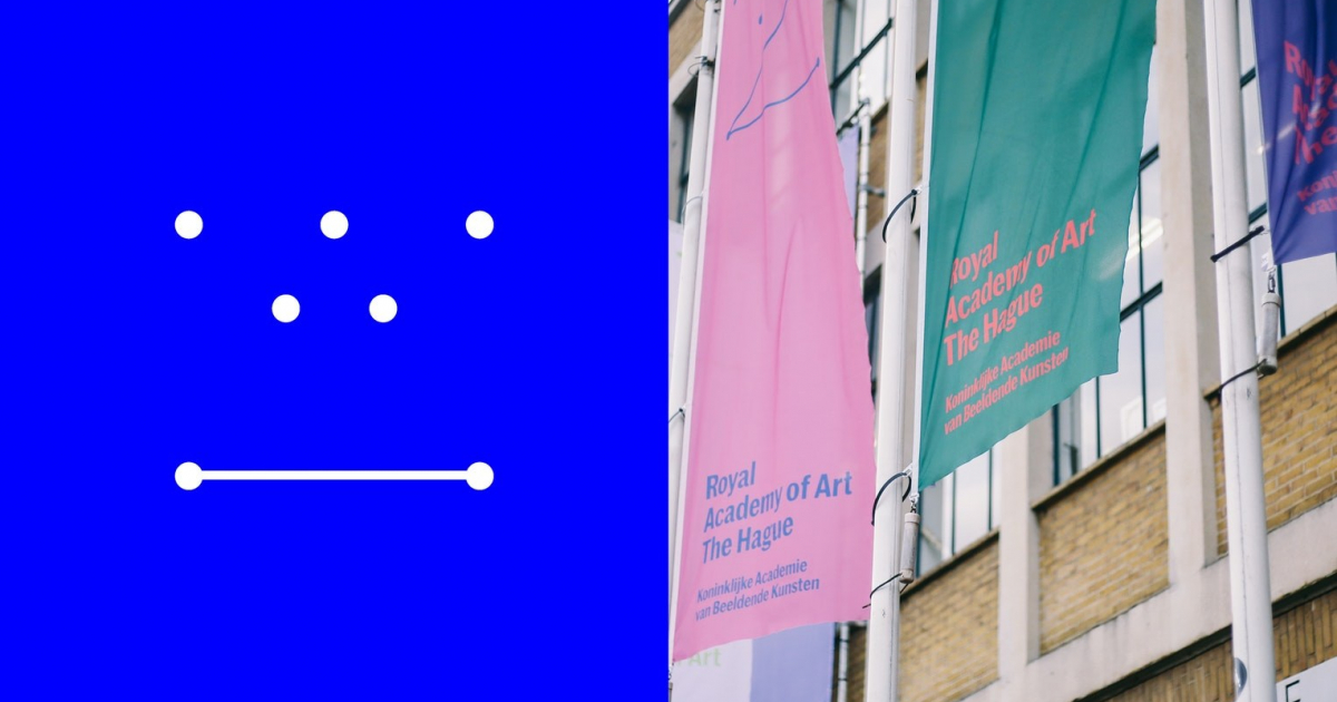
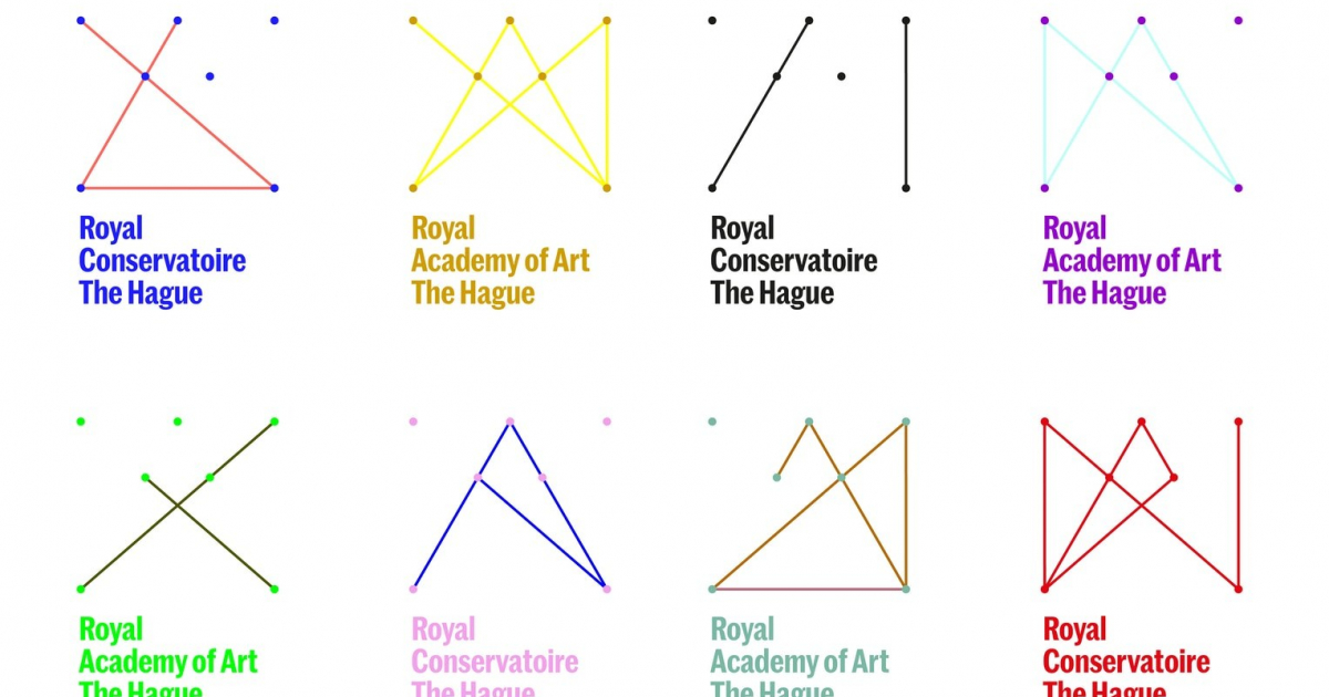
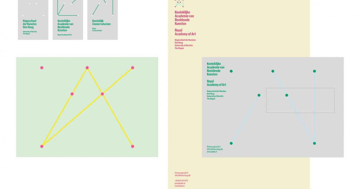
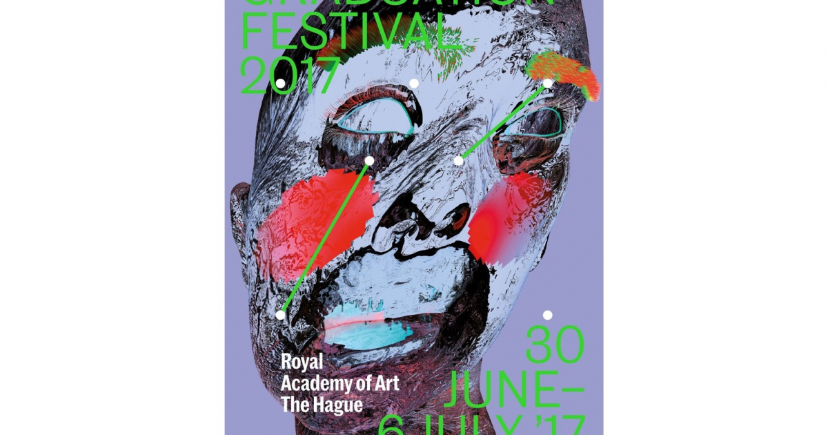
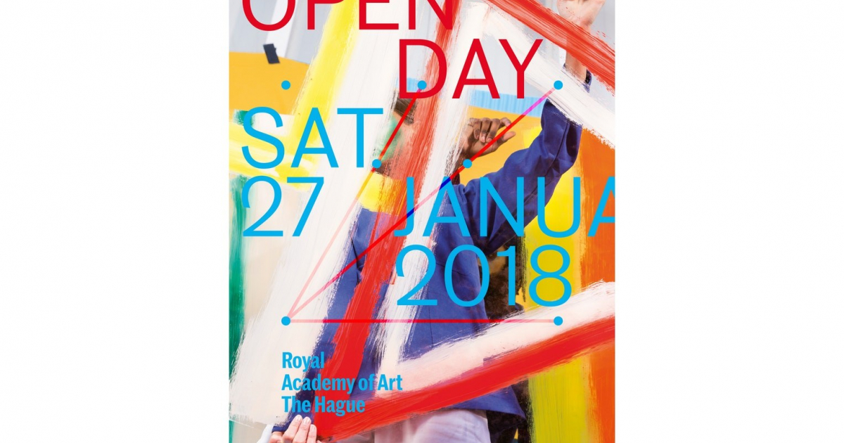
The brand identity utilizes a field of dots and lines, which together form a crown. The crown however is never fully complete, giving the possibility of 2046 different, incomplete crowns - visualizing their process-based approach.
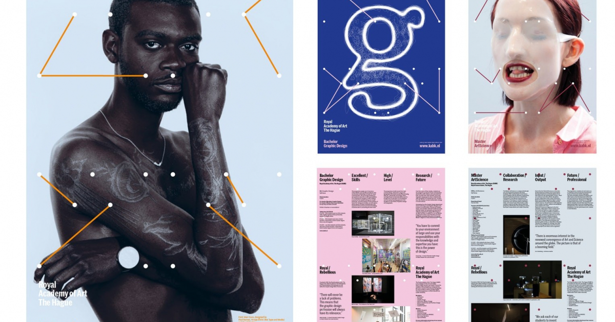
The main asset of both schools, is a strong feeling of community. To encourage the communities to own the brand, we actively involve students in creating artworks for each campaign. We developed a simple and strict graphic system that is flexible and recognizable, giving space for all sorts of visuals. By the students, for the students.
The Royal Academy of Art and the Royal Conservatoire are both internationally renowned and prestigious schools. Together with the University of the Arts, The Hague, they form a trinity organization. They asked us to develop a new brand identity to convey these messages.
The main challenge was to develop a brand identity system that leaves room for the differences between the three entities. And that would encourage students to work (and play) with this system.
Target audience external:
prospective (inter)national students and their parents, audience for exhibitions and concerts, subsidizers, press and business market.
Target audience internal:
students, staff members, (guest)teachers
