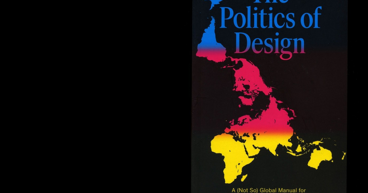
The Politics of Design
The Politics of Design came out in the Netherlands in May of 2016, and in the USA and worldwide by August of 2016. 3,500 copies were sold in the first seven months. A second print run of 4,000 is planned for February 2017. The book was adopted as educational material at many design schools and communication sciences in Western Europe and the USA. There is some interest in a Chinese translation.
Origin: I have worked for more than ten years as a designer working for different clients and in different countries like Kenya, Russia, South-Korea, Tanzania, Turkey, and the US. This raised questions about the assumptions of Western design and visual communication which can cause miscommunication and even strife. The book originated from these experiences.
Advisors/publisher: people from different backgrounds (Palestianian, Chinese, Dutch, Dutch/Somalian) advised me, to avoid cultural bias. The publishers made sure the topics were commercially interesting, and would speak to a broad international audience.
Creative idea: Although this is a design award, the design is the least interesting aspect of the book. It is produced cheaply with rudimentary binding, it has little breathing space and uses small type to accomodate all the information for a low price. Its quality is in the idea and how the chosen examples address the responsibilities of professionals in design and advertising.
New/innovative: Universities have discussed the political context of visual culture since the 1960s, but design schools, art schools and advertising schools rarely do so. There are very little or no books that deal with this issue using visual examples, written for a broad audience.
Initiative: The idea I pitched to the publisher was a guide aimed at graphic designers and communication specialists. The Politics of Design provides insights into the social and political context of their profession, and ideas for creative professionals how to work more responsibly.
Target group: The book was intended for designers, communication specialists, and image makers of all types, so it had to use a simple and accessible style of writing and visual presentation.
Cost: Because this book addresses the political and social context of visual communication, it was important that it was made entirely without any grants or subsidies, and it could exist purely based on the public’s interest in the topic. It was meant to be as cheap as possible (under €15) , while containing as much information as possible.
Timely relevance: The guide is meant to be used for a longer time. All examples had to be relevant and timely, but not so contemporary that they would become obsolete within months.
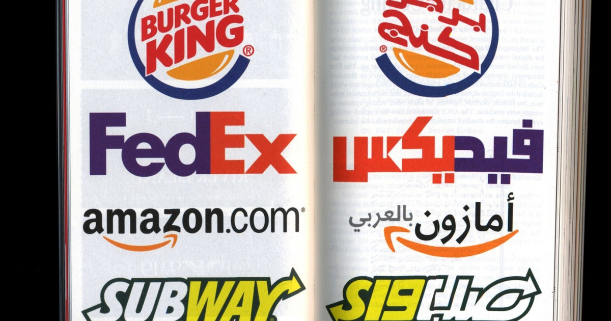
Global relevance: Even though the book is written by a white man from a West-European country, the topics and examples in the book had to reflect visual communication from around the world and relate to people from all countries or cultural backgrounds.


Jury Feedback
EDITORIAL / BRONZE
‘Really interesting content and initiative. Example for designers to take action and explore the eld you are working in.’