VPRO idents
New VPRO Idents
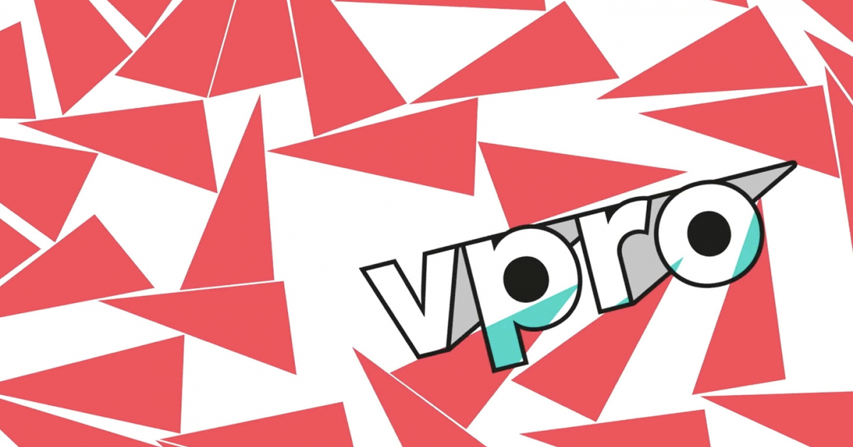
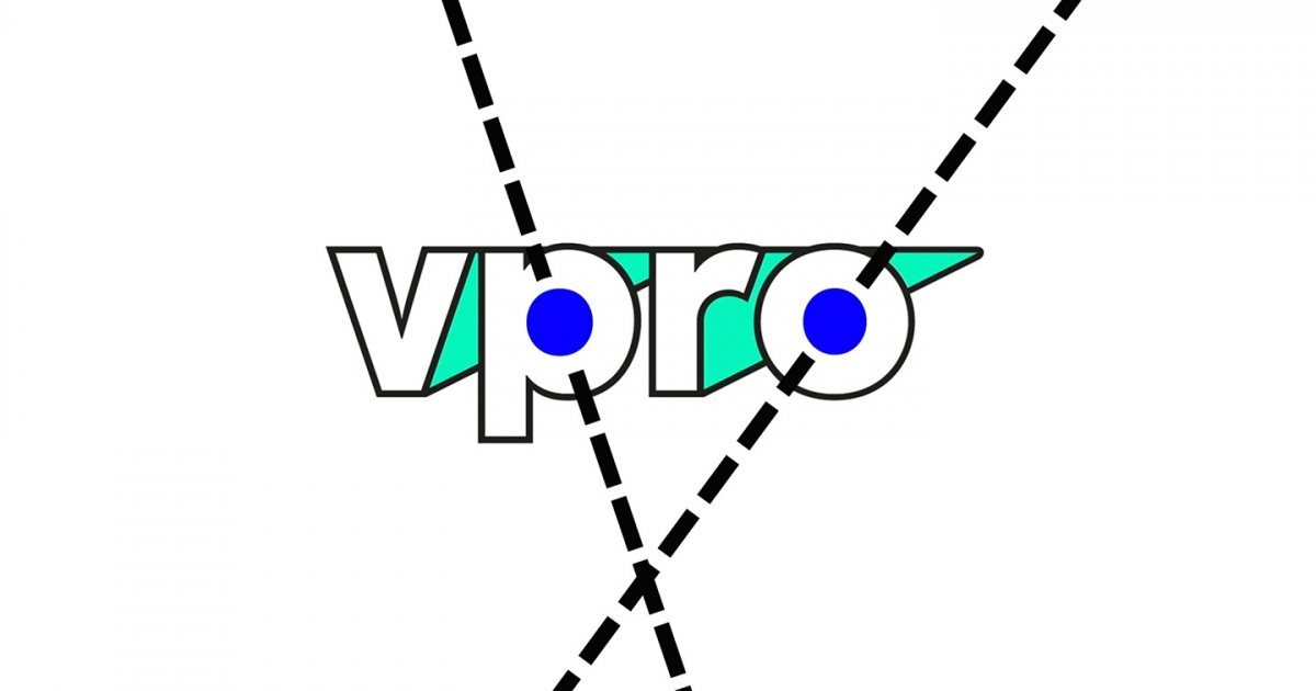
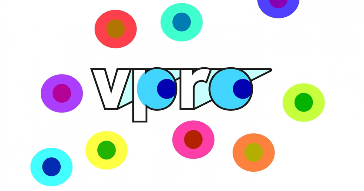
By literally opening up the logo the VPRO is showing that they are a transparent and independent broadcaster. With their programs the VPRO reflect on the issues of today's society.
By opening up the logo and developing an outline font text and image interact in a new way.
The VPRO, the much loved Dutch independent television network, that we rebranded some 10 years ago, was in need of a fresh look that would bring brand and content into a closer relationship.
Jury Feedback
CRAFT – ANIMATION & MOTION / NOMINATION
The design and animation of the VPRO Idents are almost Dutch cultural heritage. The execution of both are an ode to the unique designs and idents the VPRO has had over the years. Yet they feel refreshing and contemporary. Anyone seeing these idents can immediately place them for what they are. Using a very graphic and minimalistic approach, it pays homage to the history of the station but feels completely fresh as well. A perfect evolution of a strong design and brand. By using simple techniques and ideas, these designs feel like a breath of fresh air in a sometimes oversaturated and complex world. Communication on a basic level, is a powerful tool when left in capable hands.