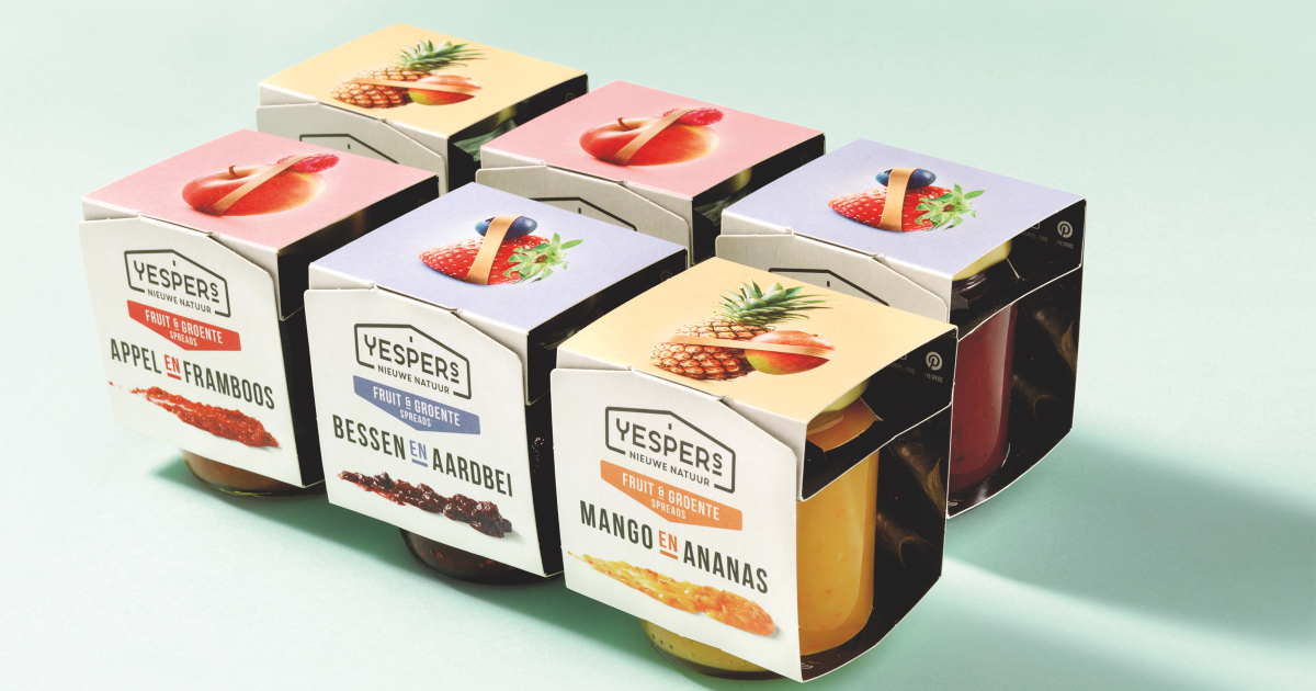
Yespers Smoothie Spread

With the literally outstanding design, Yespers managed to realize distribution at major supermarket chains like Jumbo and Dekamarkt. The response from category managers to the design were extraordinary and opened up new ways and possibilities for the first chilled smoothie spread in the Dutch market.
Consumers responded enthusiastically to this healthy, sustainable alternative to classic fruit spreads. Kids love it, their mums love it, diabetics love it, foodies love it!
Yespers received a significant amount of free publicity in local and national press, and renowned food blogs: Uit Pauline's Keuken, Francesca Kookt, I Love Health, De Groene Meisjes, Volkskrant, Boost your Health, She Magazine, Puur Gezond. And, best of all: consumers started experimenting with the smoothiespread, sharing their ideas for recipes on Facebook and creating a great deal of worth of mouth. It has been only 4 months since Yespers was launched and both distribution level and turnover are growing with only limited marketing budget. The design has already proven it’s power to engage with people on all levels, delivering the message of Yesper.
Yespers = New Nature = &
The pure visualization of ‘New Nature’ in the packaging represents the essence of this new brand and witnesses the simple and honest look and feel. New Dutch design with a clear focus on the core of the Yespers brand; bring farmers and consumers closer to each other. Connect old traditions with new technics to reach better solutions. We were inspired by Yesper himself, represented by the passionate client team with a story and background similar to that of Yesper.
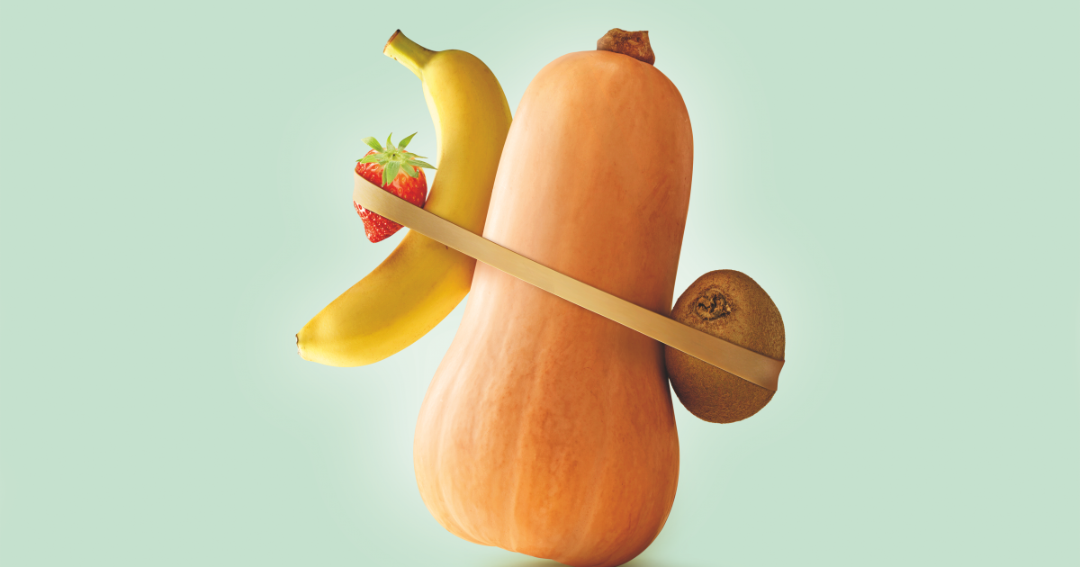
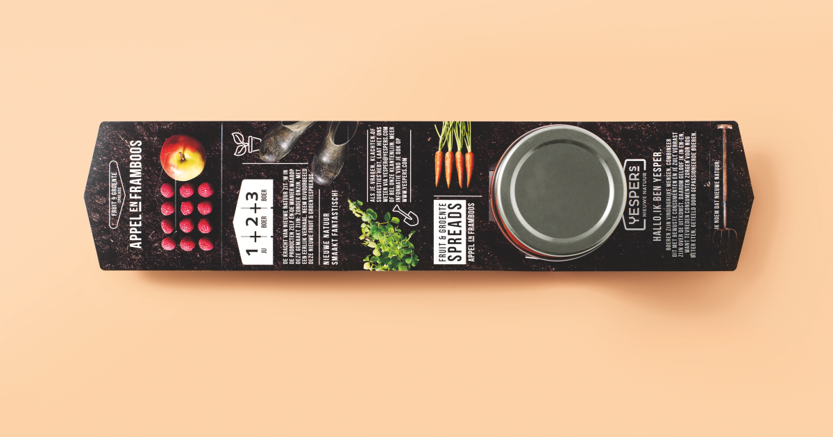
We created an iconic packaging design, right in the heart of the brand essence. The outside of the label is all about foodieness. On the inside we tell the story of Yespers in a contemporary info-graphic layout. The logo of Yespers is designed in the shape of a barn. Open and transparent in simple black and white. Quite obvious but essential and simple. The old Dutch PTT post-elastic became our hero. With this simple icon we managed to combine all that’s traditional with New Nature and - on product level - fruits with veggies. All-in all an small iconic brand with a great personality.
Growing up on a farm is like nothing else. Learn how to save water, use less resources and learn how to protect the environment whilst getting the best and most out of the land. This is the story of Yesper, son of a farmer, who believes in the equal importance of consumer, farmer and the environment. Yesper wanted to create an answer to the fast growing mass production whilst keeping the food chain as short, pure and honest as possible - eliminating unnecessary processes, taking into account impact on nature, the farmer, the shopper and the product. At the same time, he wanted to restore the connection between farmer and consumer. This is what he calls New Nature.
So with his big dreams and his entrepreneurial perspective, Yesper asked us to make him reel, giving him an identity and a voice. And to design packaging for a first range of products – 100% natural Smoothie Spreads -that would tell his story as he would: pure, simple, transparent and in a way that connects. Fruity & veggie spreads made smarter, better and just so much more delicious. The team of Coparan and Brandnew delivered a brandname (Yespers), brand spirit/pay-off (New Nature), visual ID, packaging (structural and design) and communication.